Poke Spots App
What Is Poke Spots?
Poke Spots is mobile poke ordering app completed for my Google UX Certificate that is tailored to offering a more "in- person" ordering experience. As the only UX designer, designed this project from concept to final design through research, ideation and UX design principles.
Why Poke?
I was a bit lost when it came to poke at first, but after trying different varieties, it won me over as my absolute favorite.
Ordering poke is like crafting a personalized experience, much like you would at a sandwich shop.
What sets poke shops apart is that they're often family-run and each one has its own unique charm.
Date
2019
My Roles
UX/UI Designer
Tools Used
Pen & Paper, Figma
Deliverables
Wireframes, Low/High Fidelity Mockups, User Interview Results, Prototypes
Industry
Food Ordering
Time Period
1 Month
The TLDR
asdf
asdf
asdf
The Problem
How might we give an in person ordering experience virtually through an app?
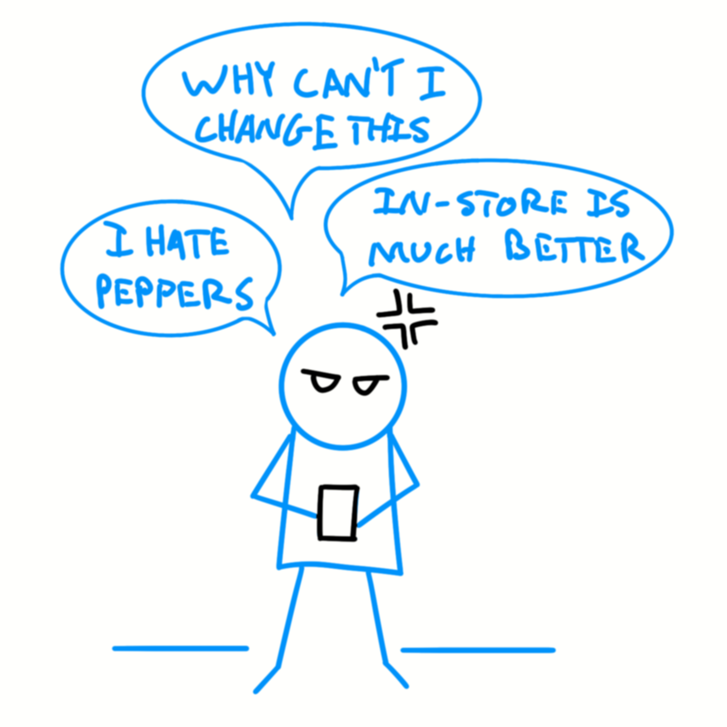
There is much more freedom when ordering in-person versus virtually. Such as, being able to customize anything and everything of the meal or drink.
Statistics Of The Problem
60% of U.S. consumers order delivery or takeout once a week.
A Harvard Business School researcher found that a one-star increase in a restaurant's Yelp rating correlated with a 5-9% increase in revenue.
Of 1,084 consumers, 50% said that an order being late frustrated them the most.

The Solution
A mobile ordering app that gamifies the ordering experience.
This will prioritize customization for shops and users that will...
make users they feel like themselves when entering the store.
boost revenue by encourage customers to buy more poke.
The Research
Participants
Interview Style
Diverse group, spanning ages 20s to 50s to cover all demographics and various poke experience.
1 on 1 interviews in-person and online.
Observed verbal and physical behaviors.
Kept time of each task/activity.
Persona
Kristy Lane
Meet a 26-year-old art student, new to the world of poke but loving it despite being a picky eater. Her busy schedule means she orders online, having plenty of cafe apps to satisfy her coffee cravings.
"Price and benefits really matter."
"Mobile ordering should be like ordering in person."
About Her
- Picky eater
- Busy art student
- Can't cook
- Self expressive
- Dietary restrictions
- Loves coffee
Pain Points
- A picky eater that needs to visualize her orders.
She misses the in-person experience but can't afford the time to wait due to her hectic schedule.
Has tons of food-ordering apps.

Market Research
Overall in the market...
Poke is a very niche segment with only local shops compared to sandwiches with international and national shops.
Well-known shops have a more established app compared.
No app has shown any effort to resemble their in-person shopping experience virtually.
Key Pages
Customization
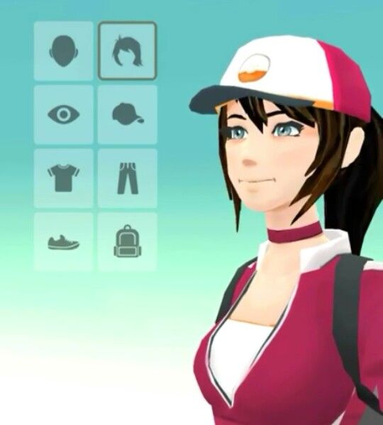
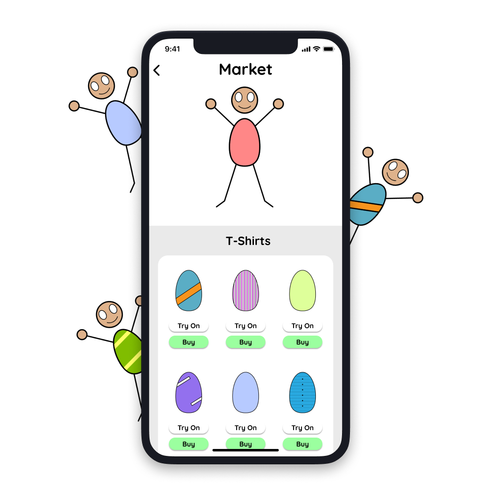
Poke attracts a diverse crowd. Customizing your character, from skin color to clothes, not only adds inclusivity to the app but also lets users represent themselves virtually.
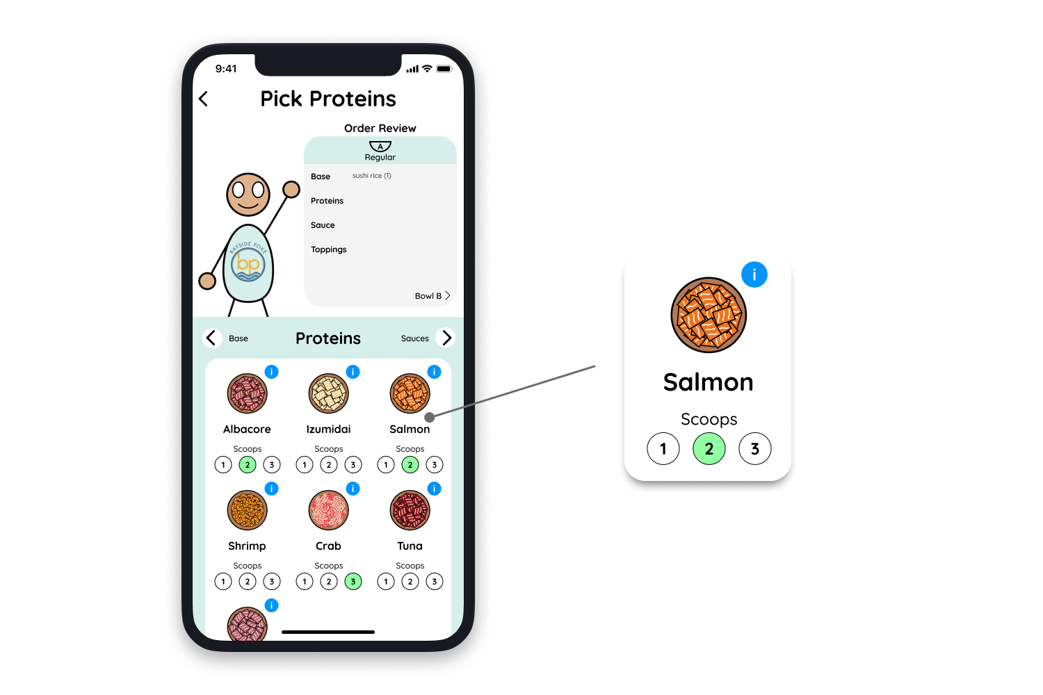
Food Ordering
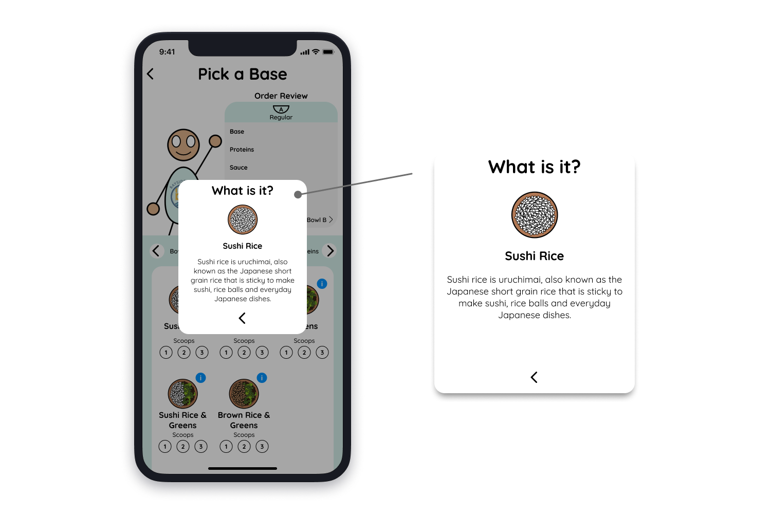
Poke attracts a diverse crowd. Customizing your character, from skin color to clothes, not only adds inclusivity to the app but also lets users represent themselves virtually.
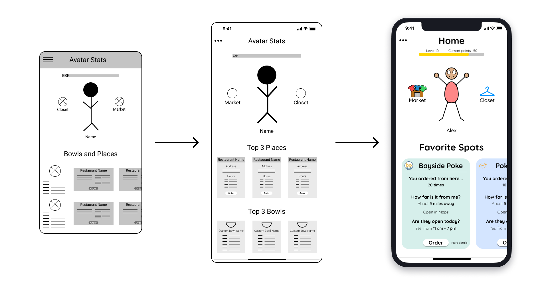
Home Page
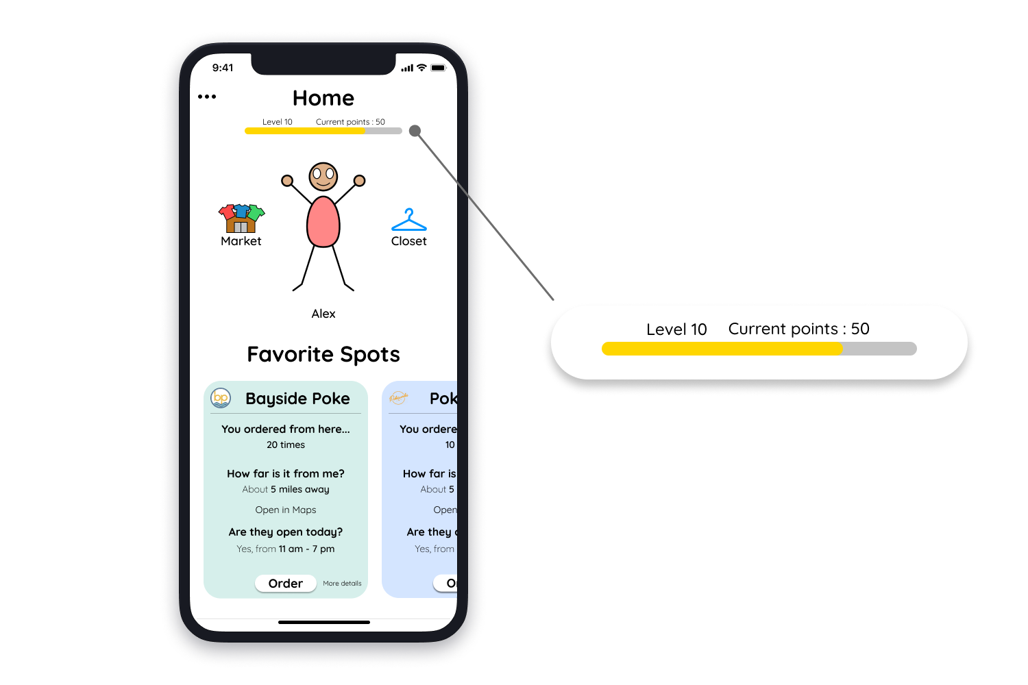
The app's everyday language, AAA Web Content Accessibility score, and complementary colors were preferred by 4 out of 5 participants.
"Everyday English words and phrases, that's good."
- Participant D -
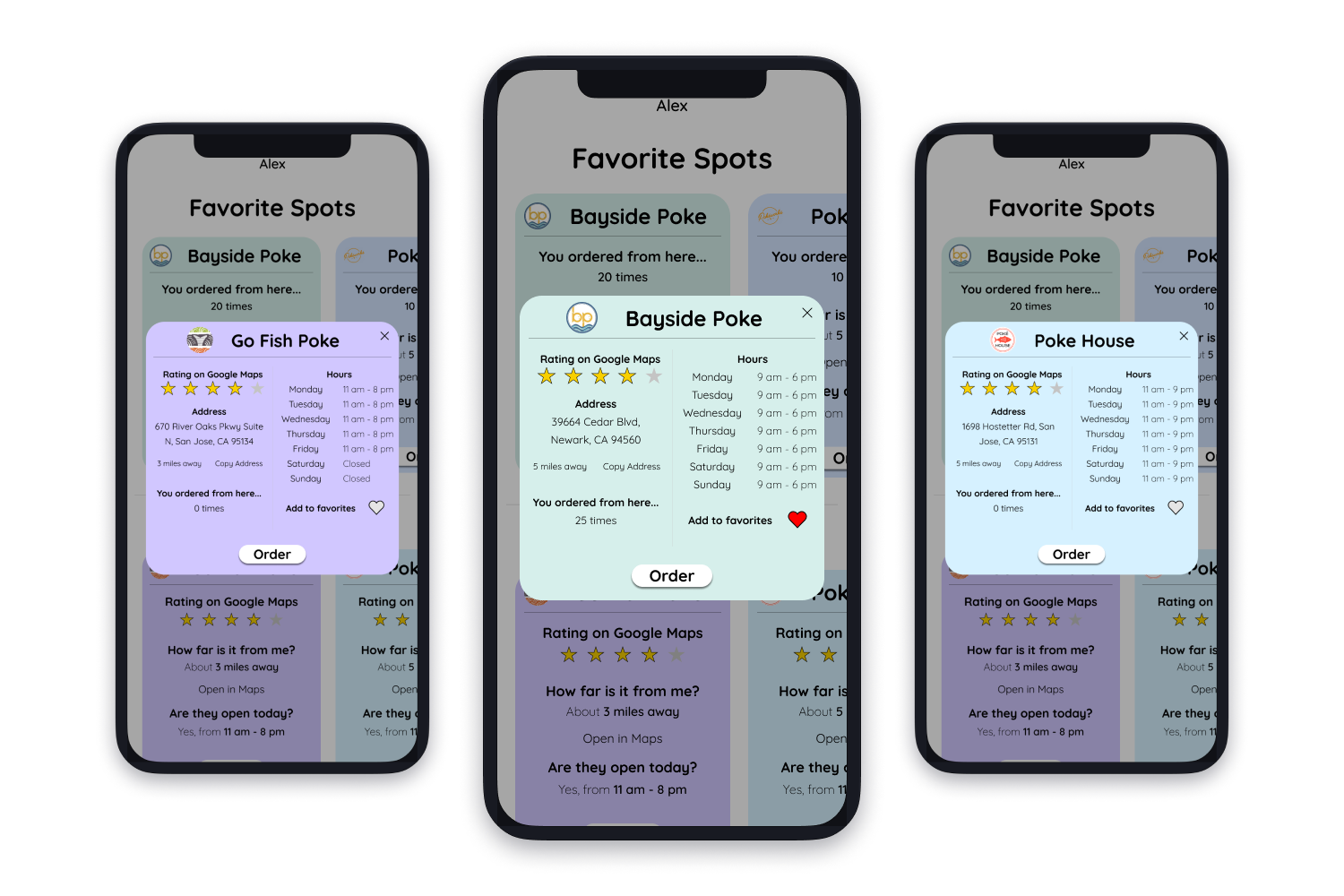
Easy access to points, the store, and the closet motivates users to buy more, benefiting both users in self-representation and local businesses.
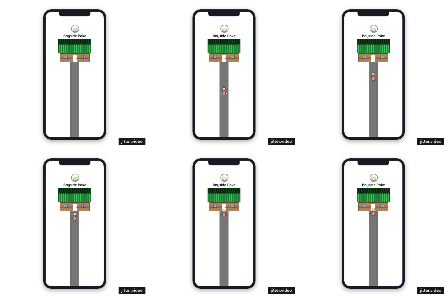
Entering A Store
This small animation detail helps give the "in-person" and gamifying experience.
Design Changes
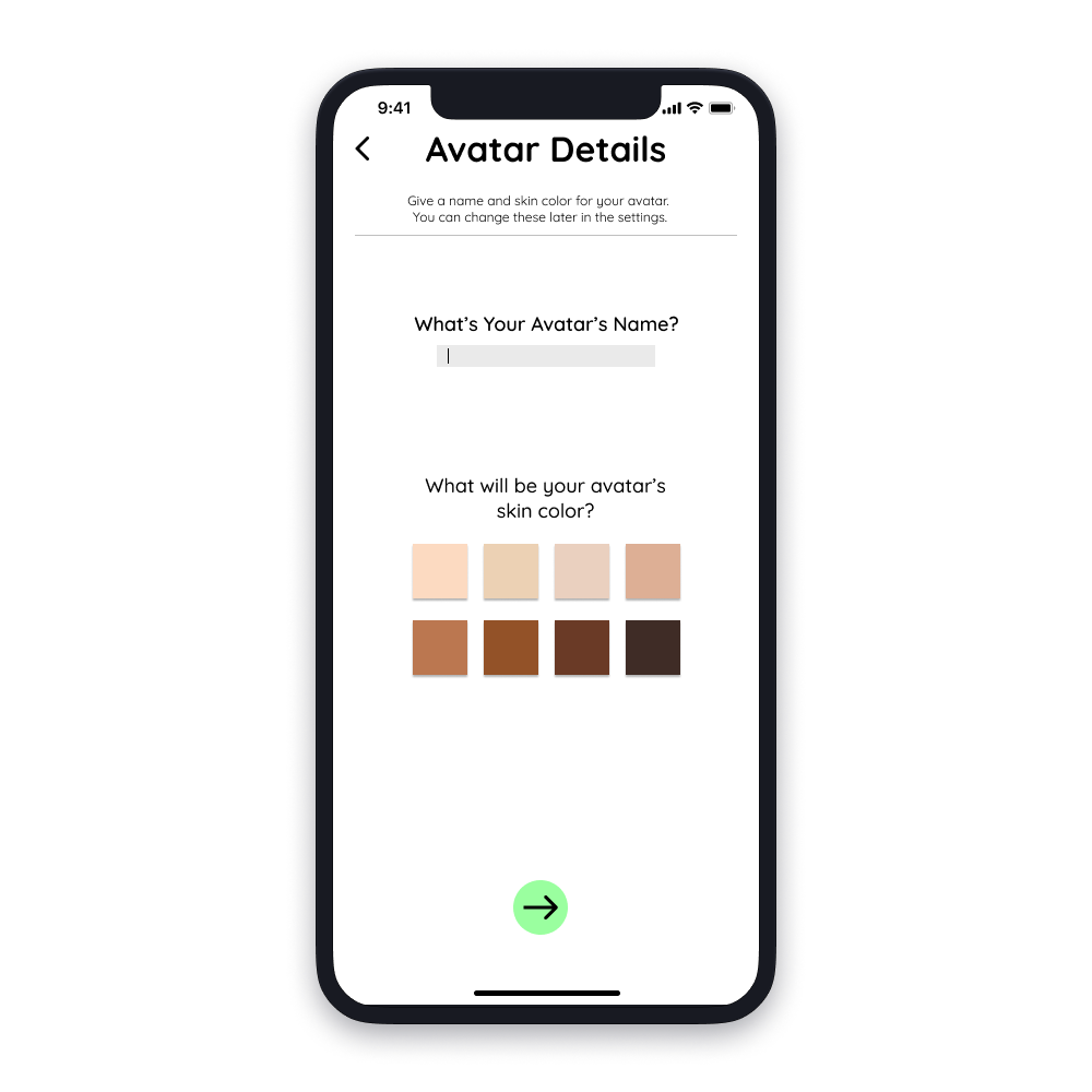
Avatar Skin Colors
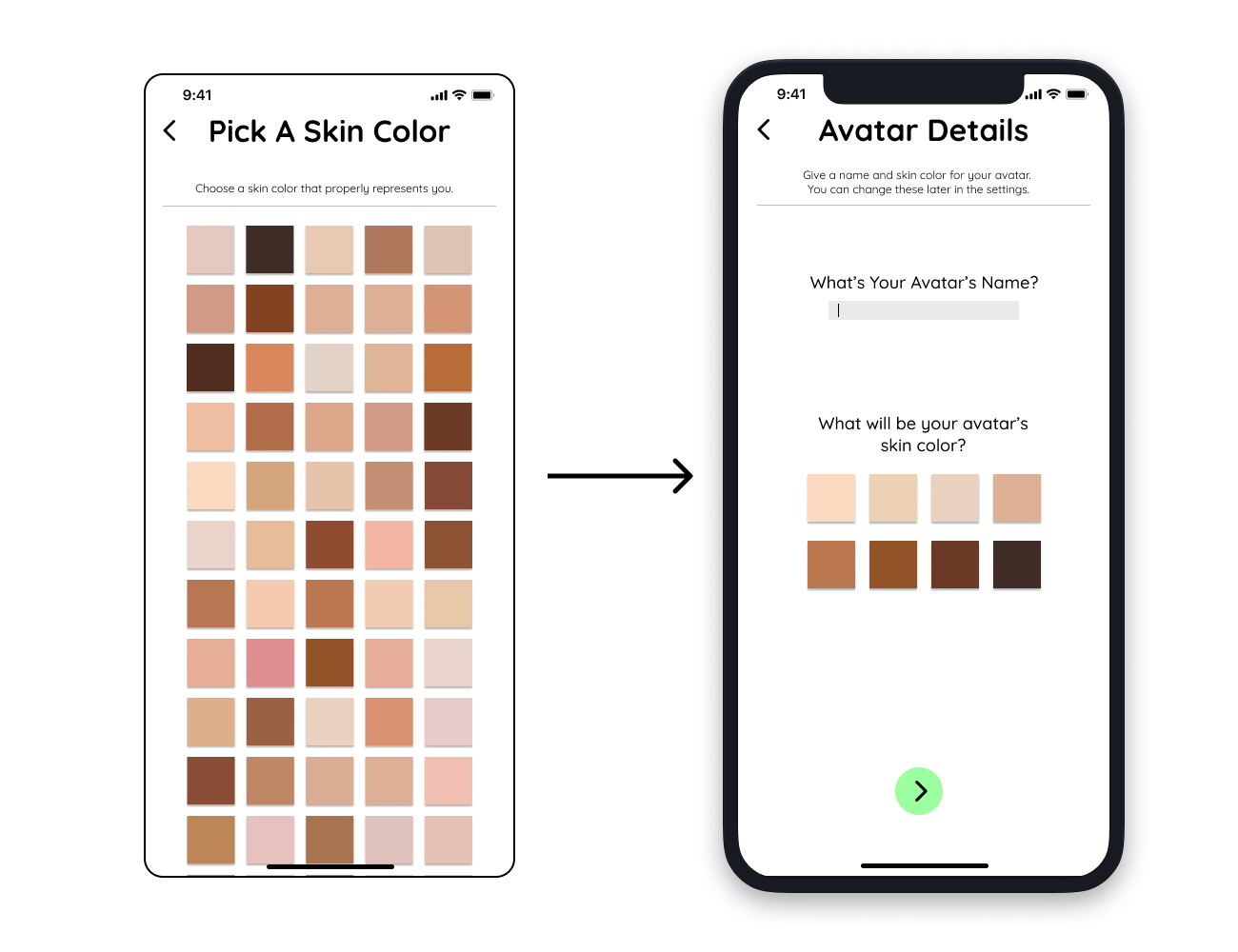
5/5 participants were overwhelmed with the abundance of skin color options.
The average of similar skin tones were calculated to narrow the 50 tones to 6.
Ordering
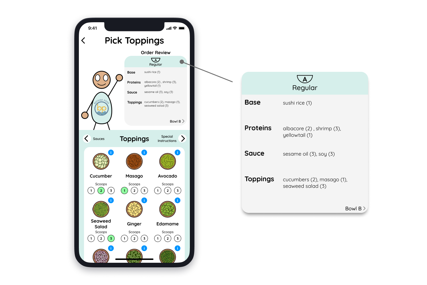
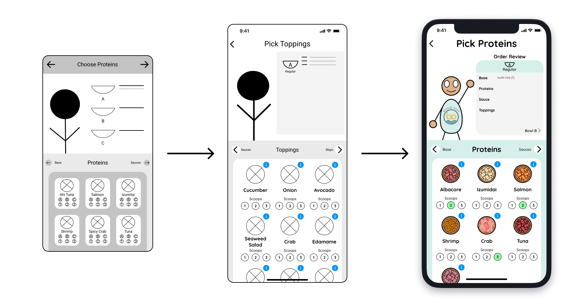
4/5 participants had difficulty understanding the "ABC 123" format, making this a severe issue that needed to be fixed.
I incorporated the "ABC 123" format into the top table, expanding the text box area for clear display of ingredients.
Home Page
Users found the text size too small; adjusting it affected the overall application design.
Using realistic values and prioritizing the main goal of an in-person ordering experience led to a redesign.
Quicksand Typface
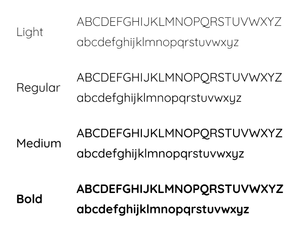
Quicksand font's rounded corners offer a welcoming feel.
Colors & Icons
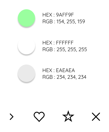
Limited color use to 3, mainly derived from the store's icons.
App Logo
App graphic inspired by popular poke bowl ingredients.
Recieved Feedback
Adjectives Used
Fun, Seamless, Different, Informative, Visual
Overall Score: 4/5
"It's like a tailored Doordash for Poke."
Participant S
"I liked how the table at the top got updated whenever I ordered just in case if I forget the previous food. In person I can see what I chose, but it's different online."
Participant S
"This app is better than my usual in-store ordering experience because the steps are really clear and no time pressure."
Participant D
Looking Back
What I Did Well
Crafted a distinctive, unmatched app concept with no counterparts in the market.
Validated assumptions through successful user testing.
Delved deeper into potential users and identified issues.
What I Can Do Later
Create an application focused on the enterprise side (Poke stores).
Research poke shop issues and solve them in the app.
What I Would Do Differently
Interview diverse individuals with varied poke experiences across age groups.
Expand avatar customization with more options from hats to shoes.
Selected Works
