Orontes
What Is Poke Spots?
Orontes, a yogurt startup, that seeks to disrupt the dairy market with a uniquely designed yogurt product.
Summary
In just 2 weeks, I collaborated with the Founder and Brand Manager to redesign their website to align with the product's design language.
Due to time and resource constraints, user interviews were not conducted.
Topics Covered
The Problem | The Solution | The Research | Key Pages | Design Changes | Received Feedback | Looking Back
Date
2023
My Roles
UX/UI Design
Tools Used
Figma
Deliverables
User Journey, Wireframe, Low/High Fidelity Prototypes
Sector
Grocery
Time Period
2 weeks
New Company, 1 Product
A small company with only 1 product.
Located in Pennsylvania
No online presence, no social media, no stores with product.
Company Goal
Disrupt the current dairy market with a less processed, creamier, richer, and sourced locally product.
Compete with current leaders in the market.
The Problem
How might we redesign Orontes website when they have no online presence at all.

Inconsistency With Product Label
Orontes website deviates from their product label, potentially confusing customers who discover it on grocery store shelf.
Weak Information Architecture
The site contains all the necessary information but is not laid out properly that will directly impact future customers.
The Solution
Redesign the Orontes website by respecting the end users, product, and company.
The Research
The research is based on an in-depth persona and significant artifacts from the product label.
Clara Garza
She's a fitness enthusiast in her late 20s that wakes up early to go a for a run and later shops at her local organic store. During her breaks she reads various fitness articles ranging from diet, exercise, and lifestyle.
About Her
Loves working out
Jogger
Researcher
Loves trying new things
Pain Points
She loves exploring the variety of products at her local organic store, trying them out, and doing research to get the most out of both the products and the companies that make them.

Reference
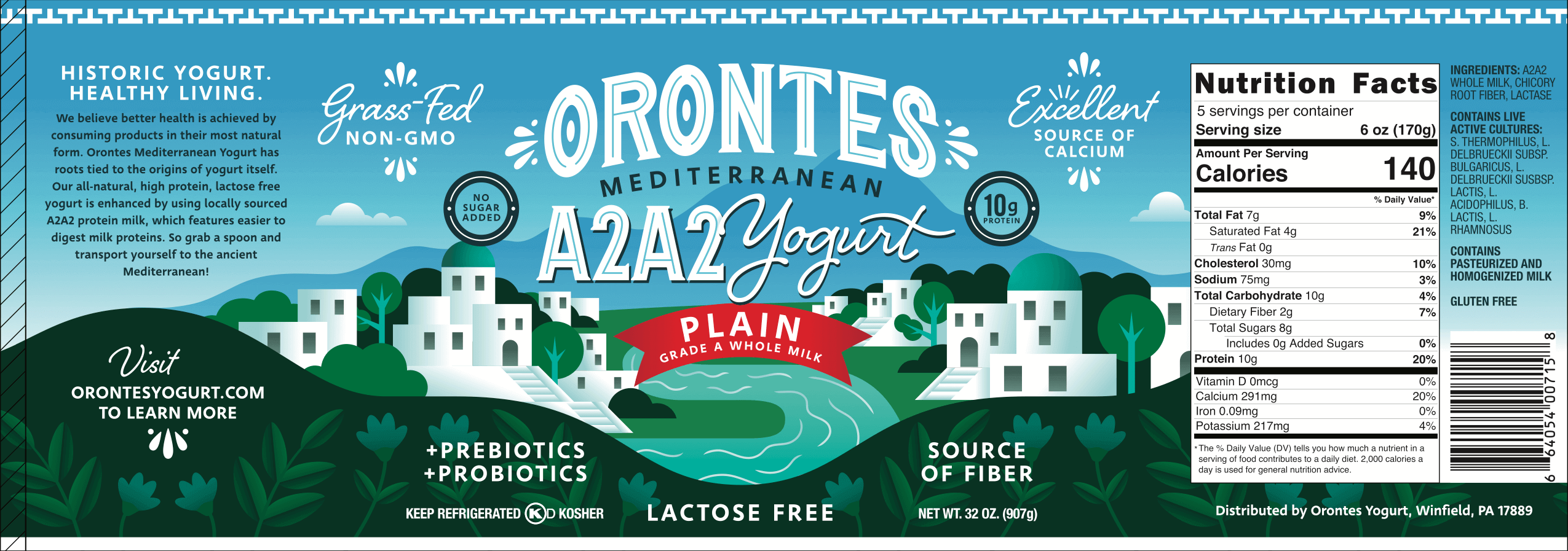
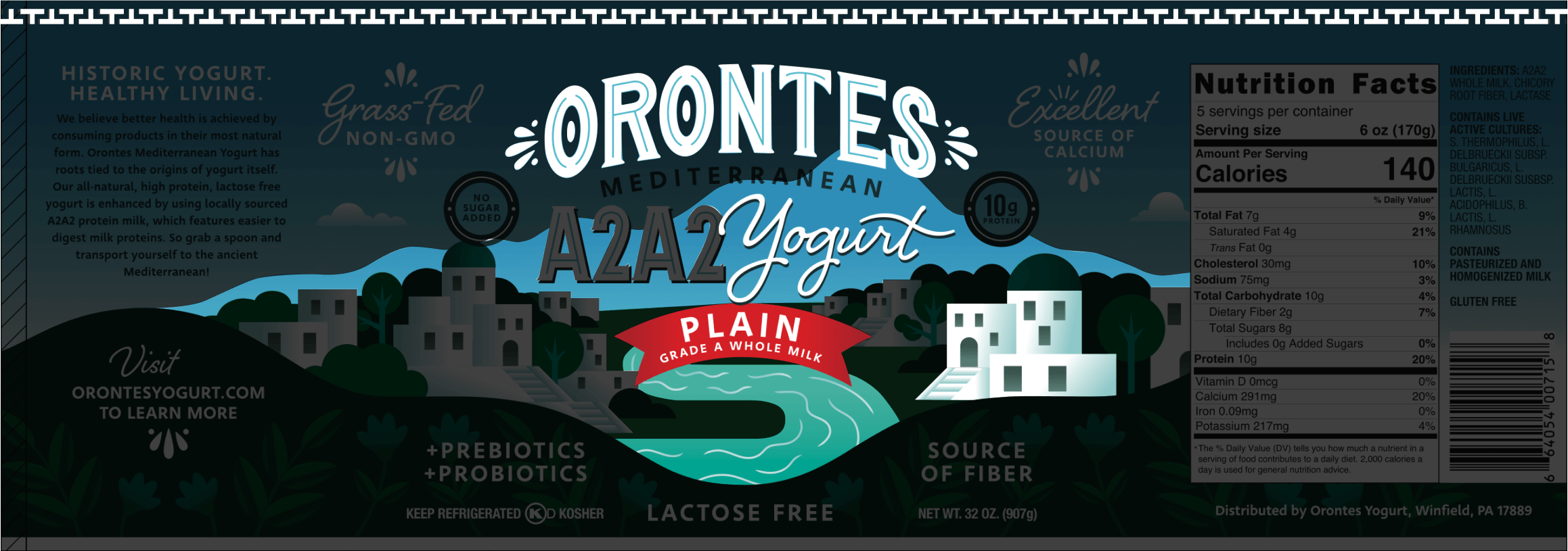
Product Label Breakdown
Font | River | Buildings | Mountain | Decorative Ribbon
Key Pages
These pages offer a great snapshot of the revamped Orontes website.
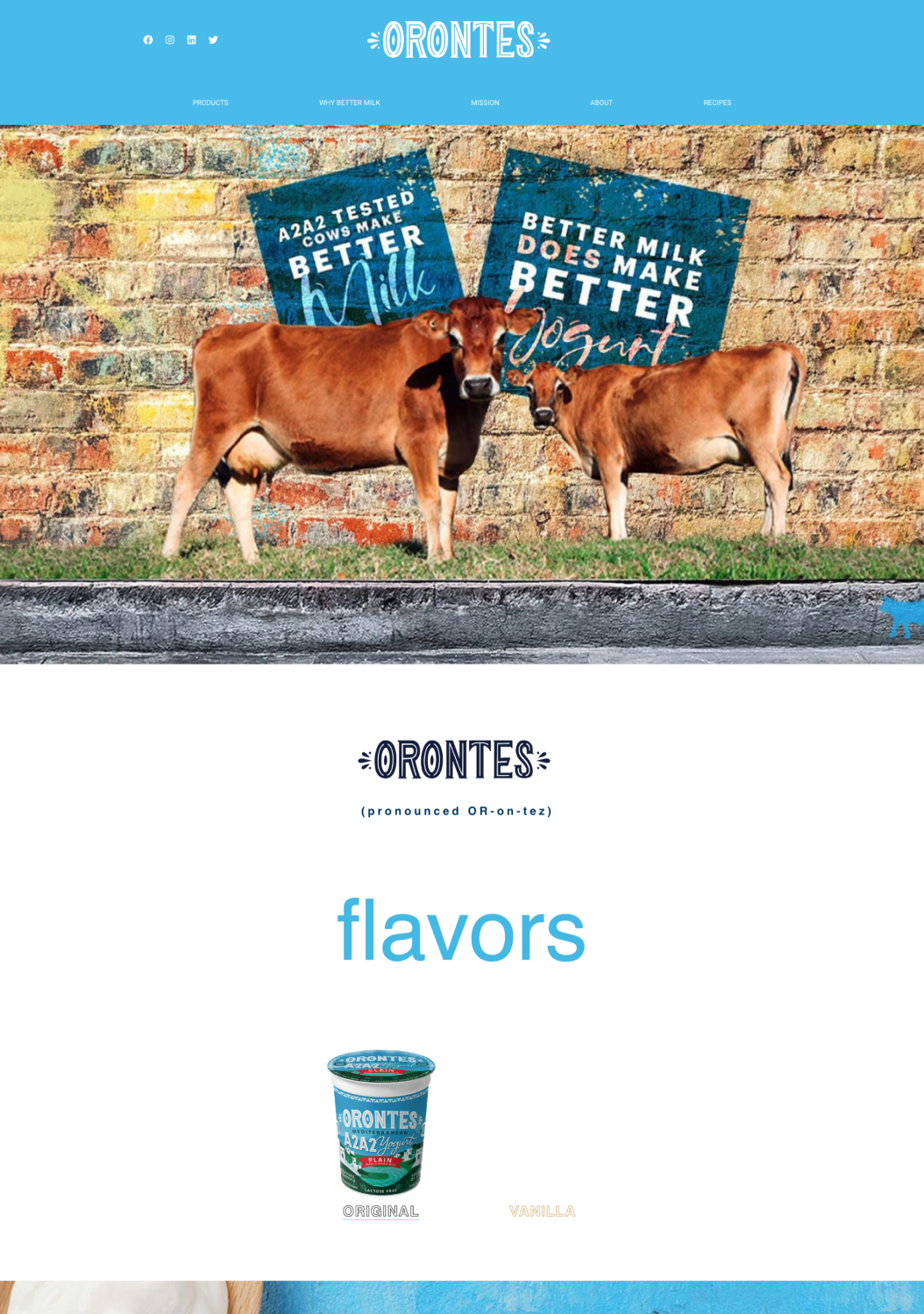
Home Page
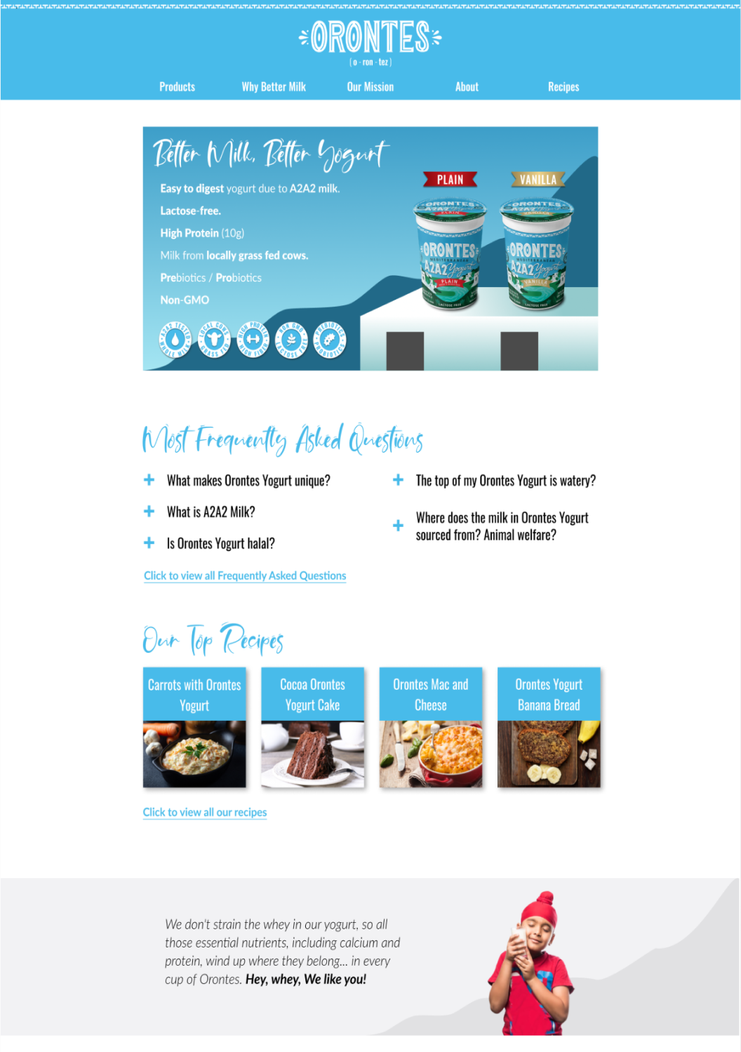
Keeping The Consistency
Specific elements from the label were incorporated into the redesign to keep the site consistent with the product.
Decorative Ribbon, Buildings


Decorative Ribbon, Buildings

Product Page
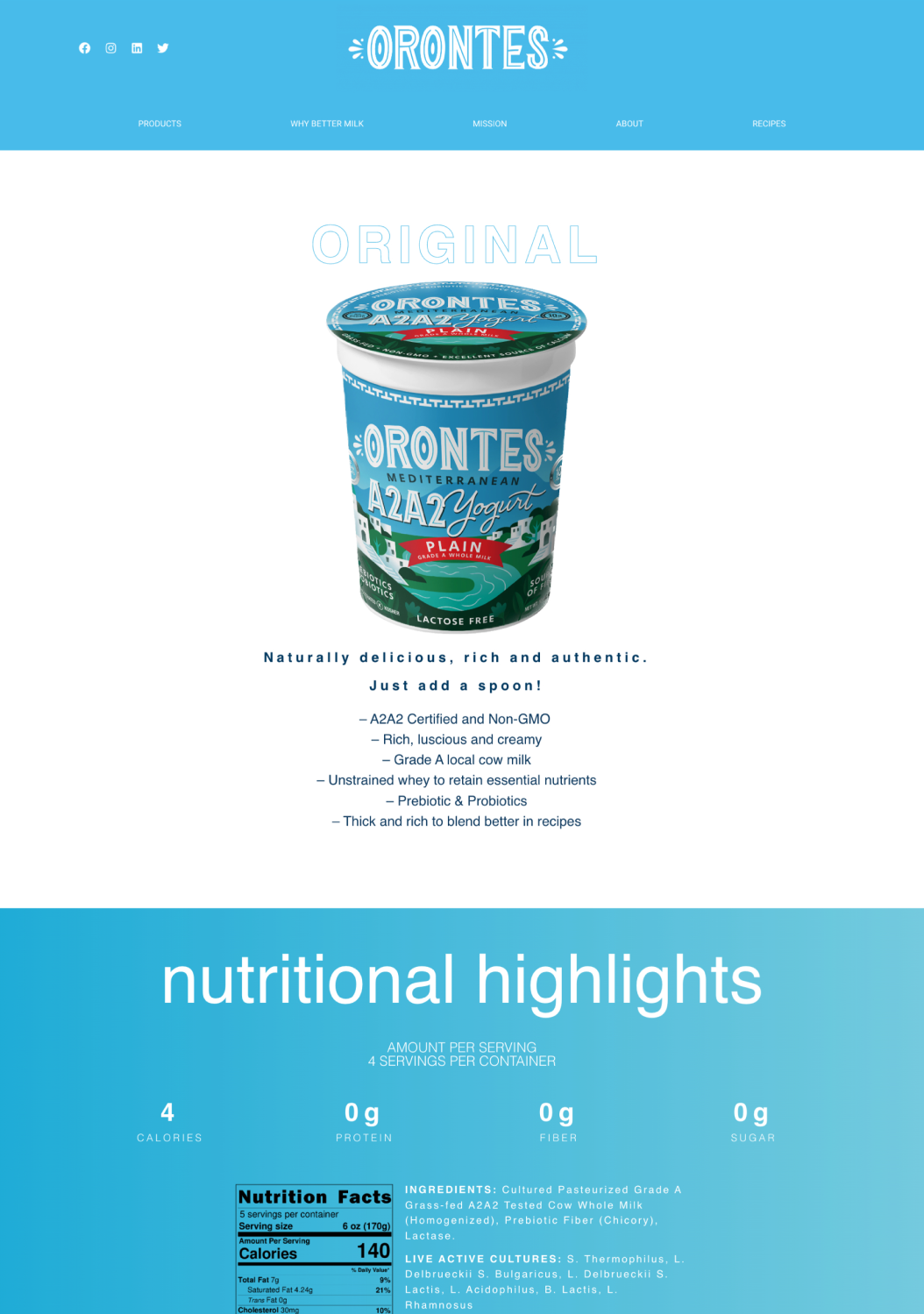
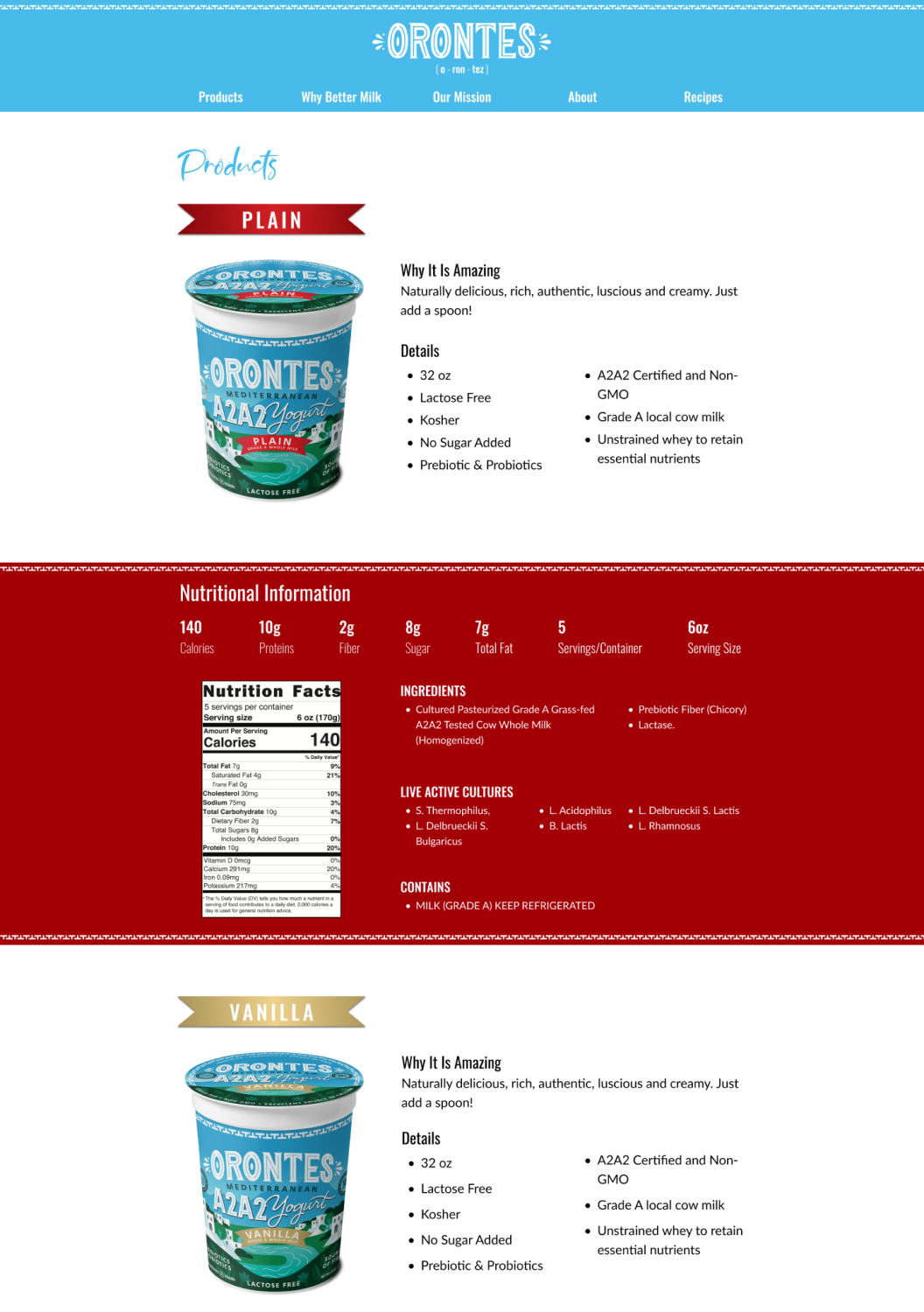
Separate Yet Together
Easier Navigation
Put two products on one page to save clicks for info.
Visual Harmony
Used same product label color for quick product recognition.
Clear Organization
Arranged content from general to specific.
About Page
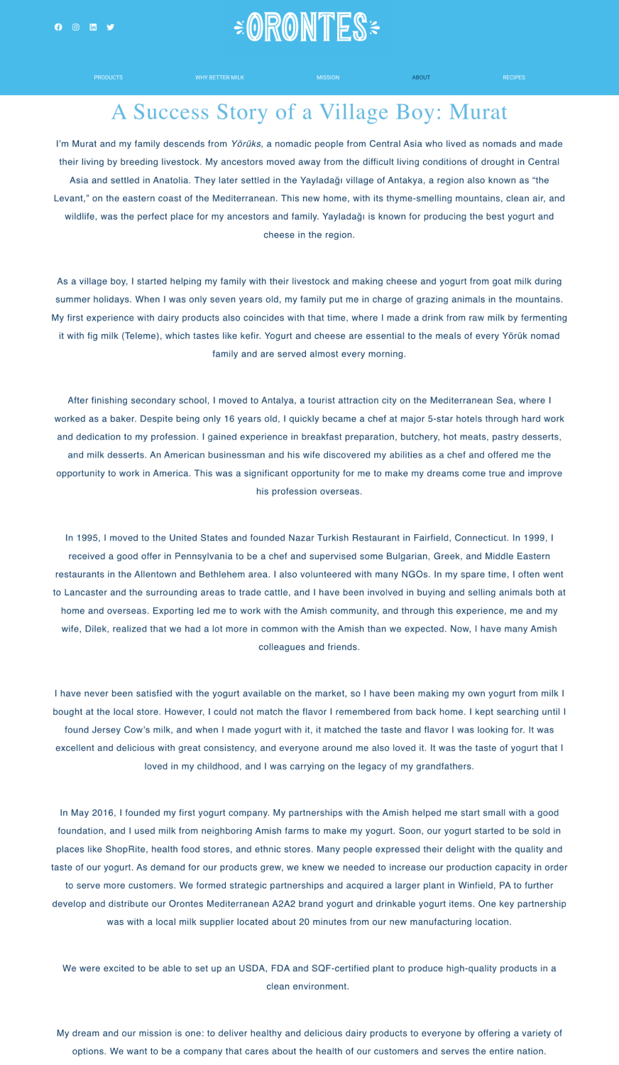
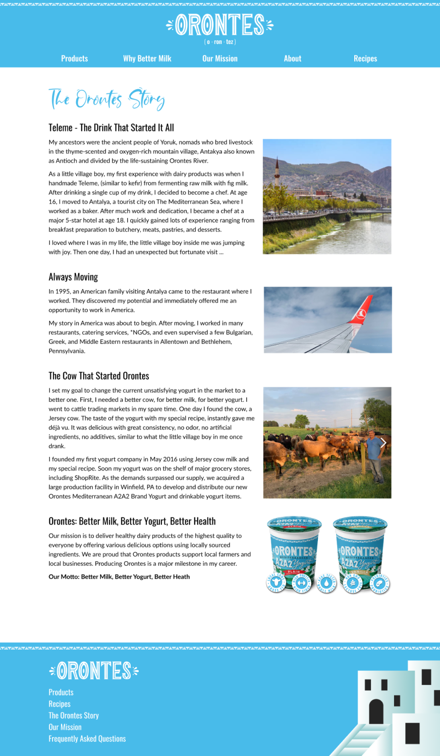
Following Human Behavior
People Skim Text
A common human habit is scanning entire pages instead of reading them.
Proper Hierarchy And Content
Dividing the story into sections (beginning, middle, end) helps new visitors to understand the gist of the page along with the aid of pictures.
Looking Back
Looking back is the roadmap for the next steps.
What I Did Well
Achieved a successful website redesign, aligning it seamlessly with the product design.
Significantly reduced user hassle through improved visuals and strategic content placement.
What I Can Do Later
Contact the founder and brand manager to discuss their site experience and available resources for user interviews.
What I Would Do Differently
Suggest extending the project timeline for a deeper exploration of company goals and resources.
Also, include a list of in-store product locations.
Selected Works