
Jenkins
A Digital Secretary For The Messages You Forgot
48% of people say a slow reply has hurt a relationship.
Jenkins makes sure you're not one of them.
Scroll Down ⬇
Lean UX Iterative Prototyping Recognition Rather Than Recall








PROJECT METADATA
The Basics
ROLE
UX Designer
UX Researcher
MEMBERS
Suleyman Sarigoz (me)
INDUSTRY
Productivity / AI Agent Tools
TIMELINE
2.5 Months
TOOLS
Figma
ChatGPT
The Lean Startup
PROJECT CONTRAINTS ◼︎
Working Within Real Limits
SCOPE & TIMELINE
A Study, Not A Startup
This project was scoped as a Lean UX study within a 2.5-month academic timeline.
RESEARCH VALIDITY
Real Patterns, Small Sample
Usability testing involved 3 participants, so findings are directional, not statistically validated. All sessions were single-sitting Zoom calls, a controlled environment that's hard to reconcile with the real-world interruption and app-switching Jenkins is actually built for.
PLATFORM & MEASUREMENT LIMITS
Built Around What the Platform Allows
Platform constraints shaped the concept too: iOS's privacy restrictions cap automation at semi-automated flows, while Android supports it fully. And since testing focused on interface and usability preferences, questions like whether Jenkins actually reduces missed replies or relationship strain over time remain untested.
PROBLEM & SOLUTION ✖︎❤︎
The Cost of Forgetting, The Case for Jenkins
THE PROBLEM
Too Busy to Remember, Too Guilty to Forget
Busy professionals miss replies because remembering a future task while mentally elsewhere ("prospective memory") loses to distraction.
A missed message costs more than time: strained relationships, lost opportunities, and lingering guilt.
The Real Cost of a Slow Reply
"It takes 23 min to focus after getting distracted." - UCl.edu
"Workers who completed tasks in parallel took 30% longer and made 2x as many errors." - Richard L. Byyny, MD
"48% have had a relationship negatively impacted because of their slow response to messages." - Secure Data Recovery
THE SOLUTION
From Recall To Recognition
Jenkins is an AI reminder agent that surfaces forgotten messages and calls across apps, so users recognize them instead of recalling them.
It tracks the senders you mark as important, so it filters noise by your choices, not by AI guessing.
It offers summaries in varied lengths and reminders at times you set.
The goal is fewer, smarter notifications, shifting effort from "did I reply?" to "oh right, there it is."
THE RESEARCH ◉
What I Learned
LITERATURE REVIEW
Reading the Research on Memory Under Stress
Why
I needed to know why busy people forget to reply, so the design would target the cause, not the symptom.
Reading Takeaways
Mild stress can help prospective memory, but chronic stress sharply lowers it.
Busy students with high state anxiety showed very low performance.
Multitasking splits focus across tasks and slows progress.
The research recommended environments that promote recognition over recall.
Chronic Stress: Long-term, ongoing stress.
Intention Retrieval: Recalling what you planned to do.
Intention Offloading: Using tools or cues to remember tasks.
* Recommendations were to create an environment that would promote the use of recognition rather than recall. *
Multitasking Myth: The false belief we can focus on tasks equally at once.
Sources
Design Decision
Recall versus recognition became the core rule: Jenkins surfaces messages instead of asking users to remember.
Chronic stress hurting memory pointed to fewer, smarter notifications, not more reminders.
ARCHETYPE
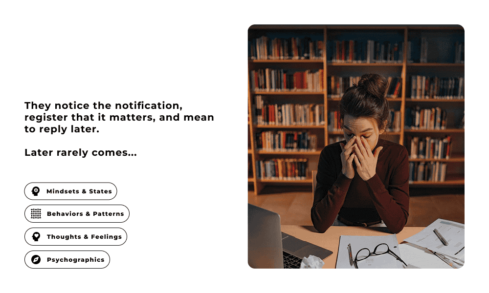
The User Drowning in Notifications
Why
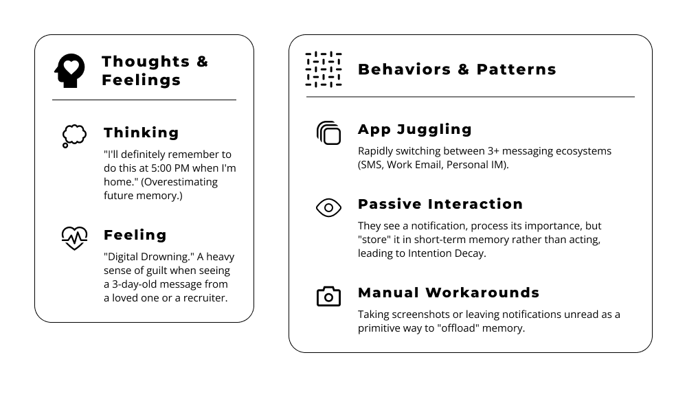
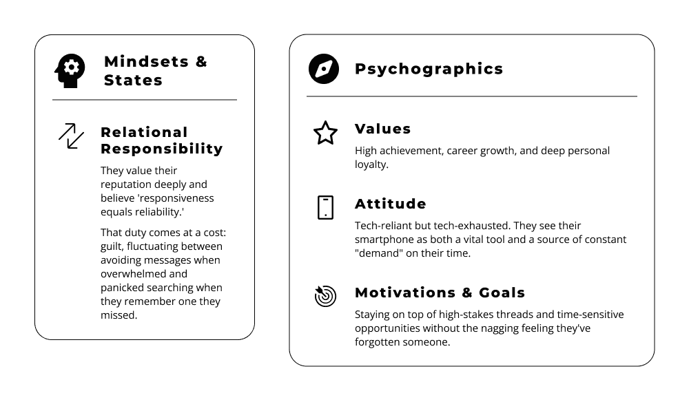
The research explained why people forget, but not who forgets or how they cope. I started with my own struggle and checked it against what others describe publicly.
Design Decision
App juggling and passive interaction led to one place for missed messages, with prompts at the right moment.
Tech exhaustion led to fewer, smarter notifications, then user-set reminders after testers pushed back.
Manual workarounds, like asking a person to nudge you, showed the need for a digital secretary.
MARKET RESEARCH
No One Has Solved This Yet
Why
I checked whether existing tools already solved missed replies, so I would not build something that existed.
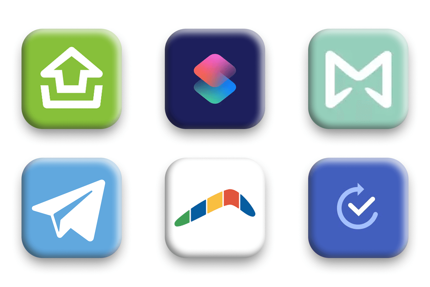
Tools like FollowUp, Boomerang, and Mailbutler remind you of unanswered emails.
Messaging
Most apps depend on Apple Reminders. Telegram offers reminders, but you set them manually.
Phone Calls
I found no solutions.
OS-Specific
iOS Shortcuts/Android Routines allow manual automations.
Design Decision
No tool I found spans email, messaging, and calls, so Jenkins works across apps and covers missed calls.
OS automations are effort-heavy, so Jenkins prompts for you instead of asking you to build a routine.
MINDMAP
Exploring Potential Features
Why
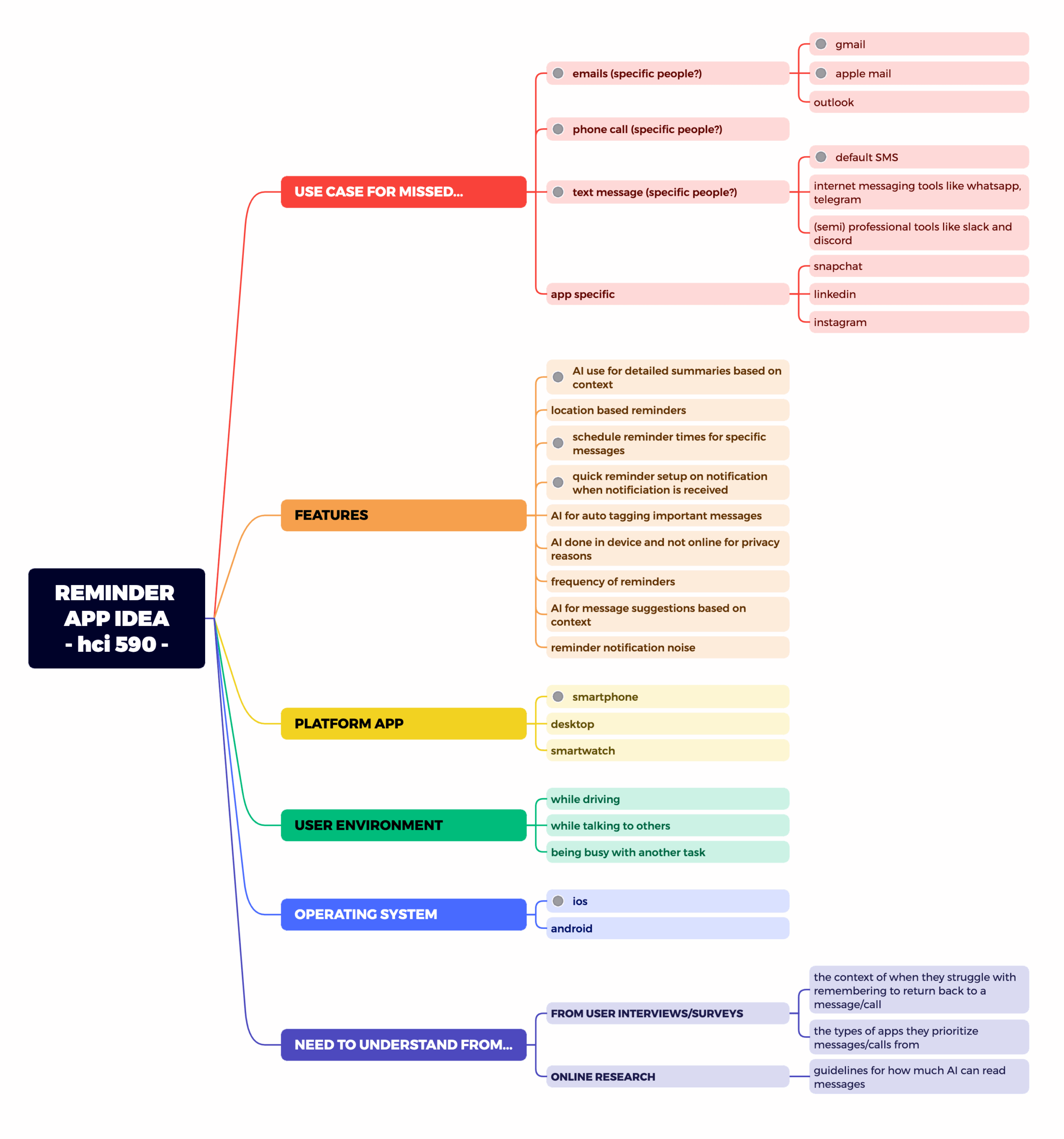
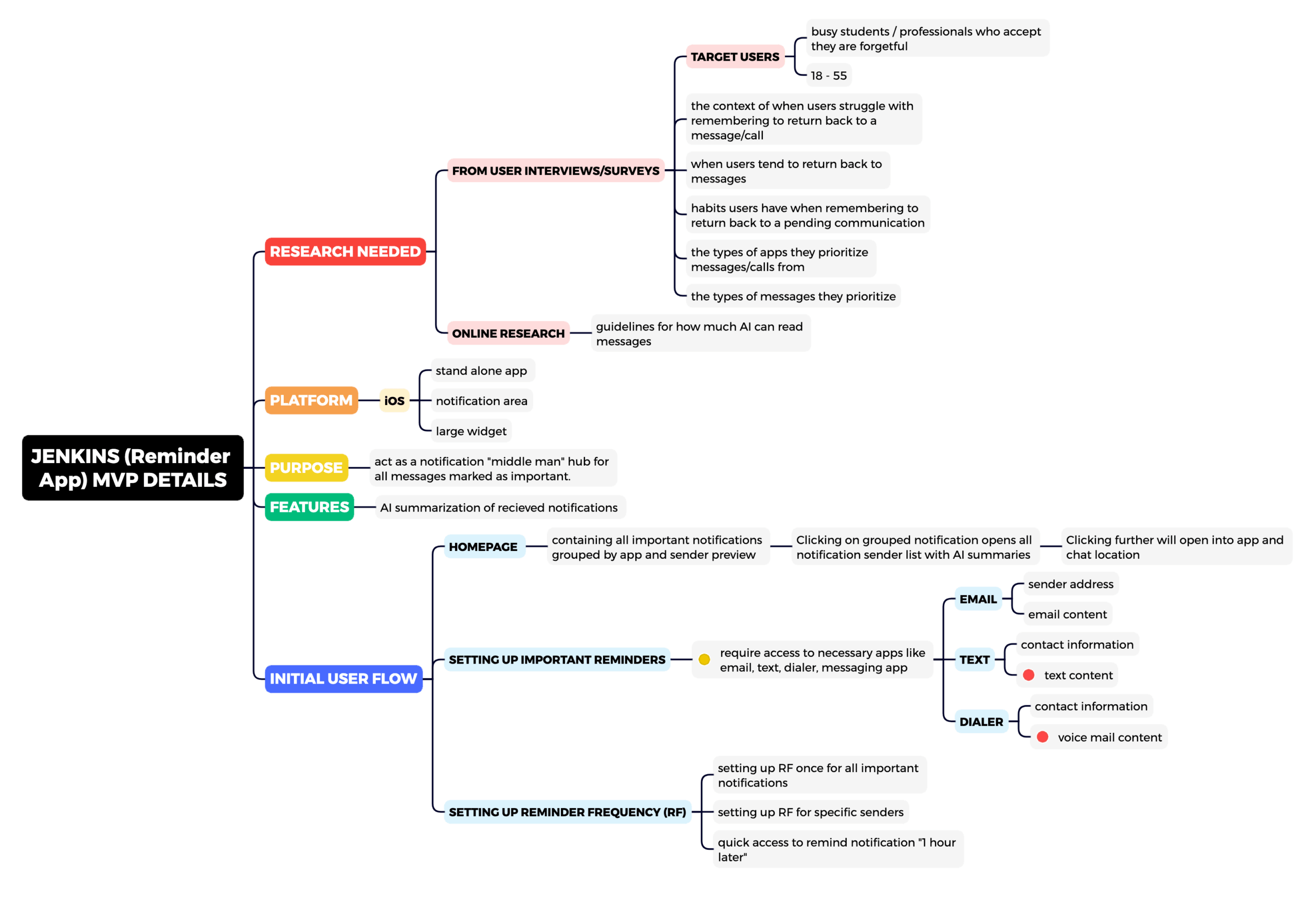
The research produced more feature ideas than a 2.5-month study could cover, so I mapped them to find an MVP.
First Mindmap
shows a broad features ranging from various use cases, operating systems, technology device, ideas needed to be researched.
Second Mindmap
shows the MVP features ranging from user flows, further research details.
Legend
● cannot be done
● requires further research
● for MVP
Design Decision
MVP: Android, important senders only, across email, calls, and messaging apps.
Cut for the 2.5-month timeline: desktop, smartwatch, AI auto-tagging, and AI replies. iOS was cut for privacy limits.
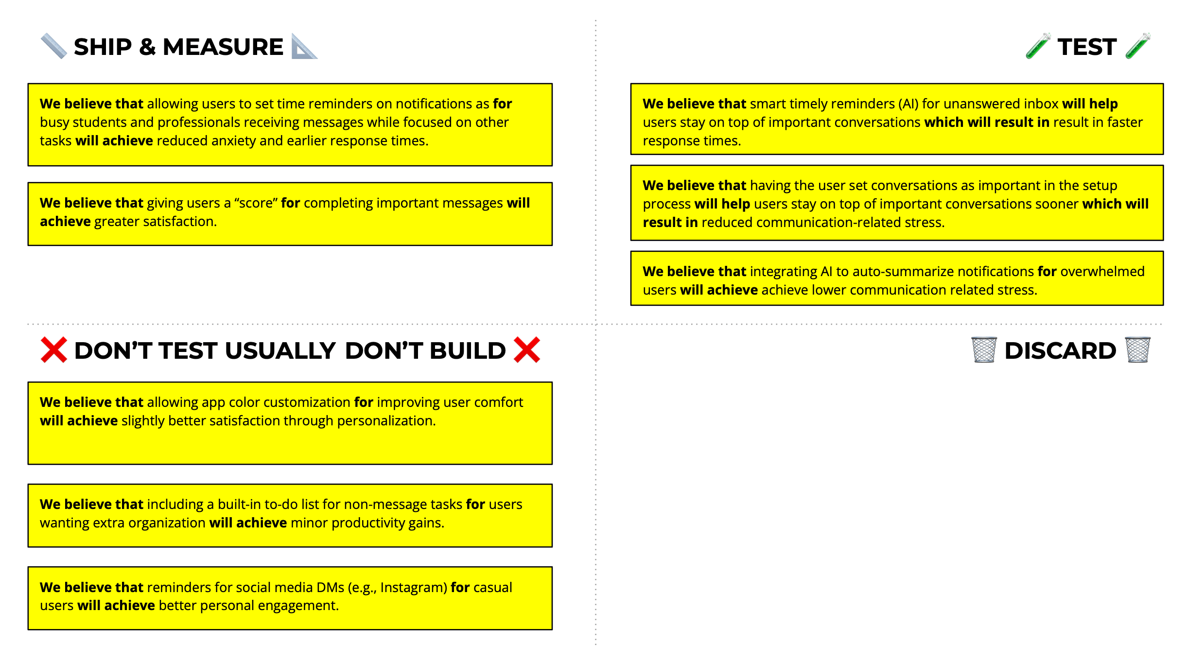
HYPOTHESIS PRIORITIZATION CANVAS (LEAN UX)
Testing The Riskiest Assumptions First
Hypothesis Testing
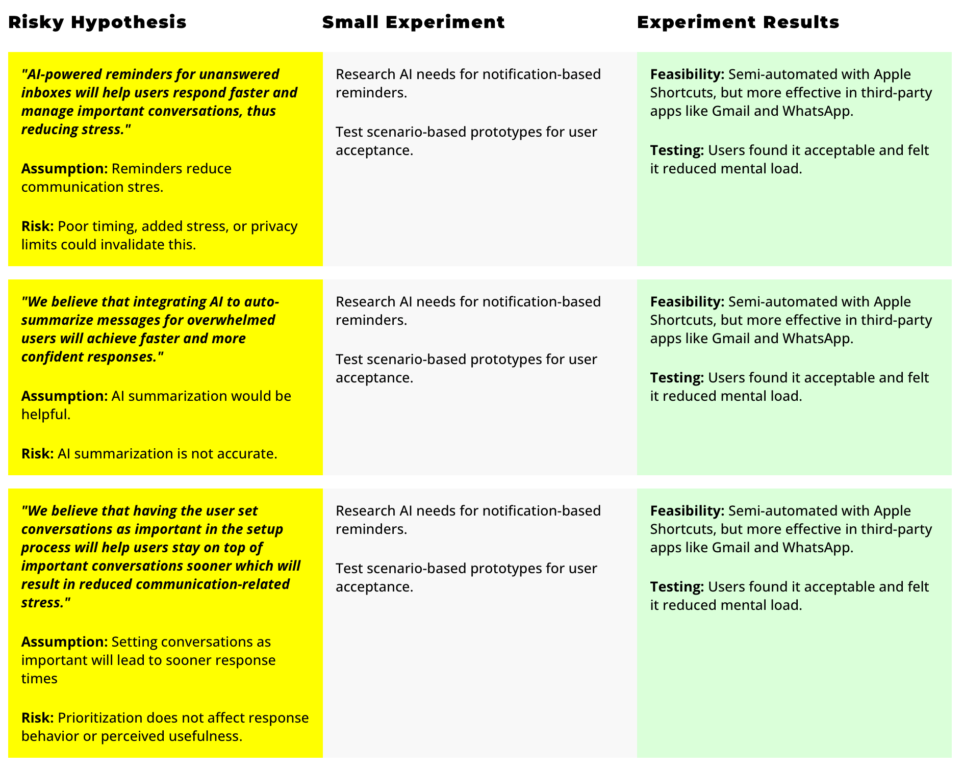
Based on the "Hypothesis Prioritization Canvas" above, I created small experiments to undersand the feasibility of the features.
*iOS allows only semi-automation due to privacy rules, while Android supports full automation with flexible APIs.
VISUAL INSPIRATION BOARD
Designing for Clarity, Not Clutter
Why
Jenkins pulls many apps into one view, so I looked for layouts that keep each source separate and scannable.
My Jenkins UI design is inspired by images highlighting organization through shapes, lines, colors, and typography.

Design Decision
Bento Box became the layout for AI notifications, with colors matched to each app.
High Contrast became a rule: every color pair passes WCAG AA, and some pass AAA.
KEY PAGES ❖
From General to Specific
CONTENT FUNNEL APPROACH
General First, Detail Later
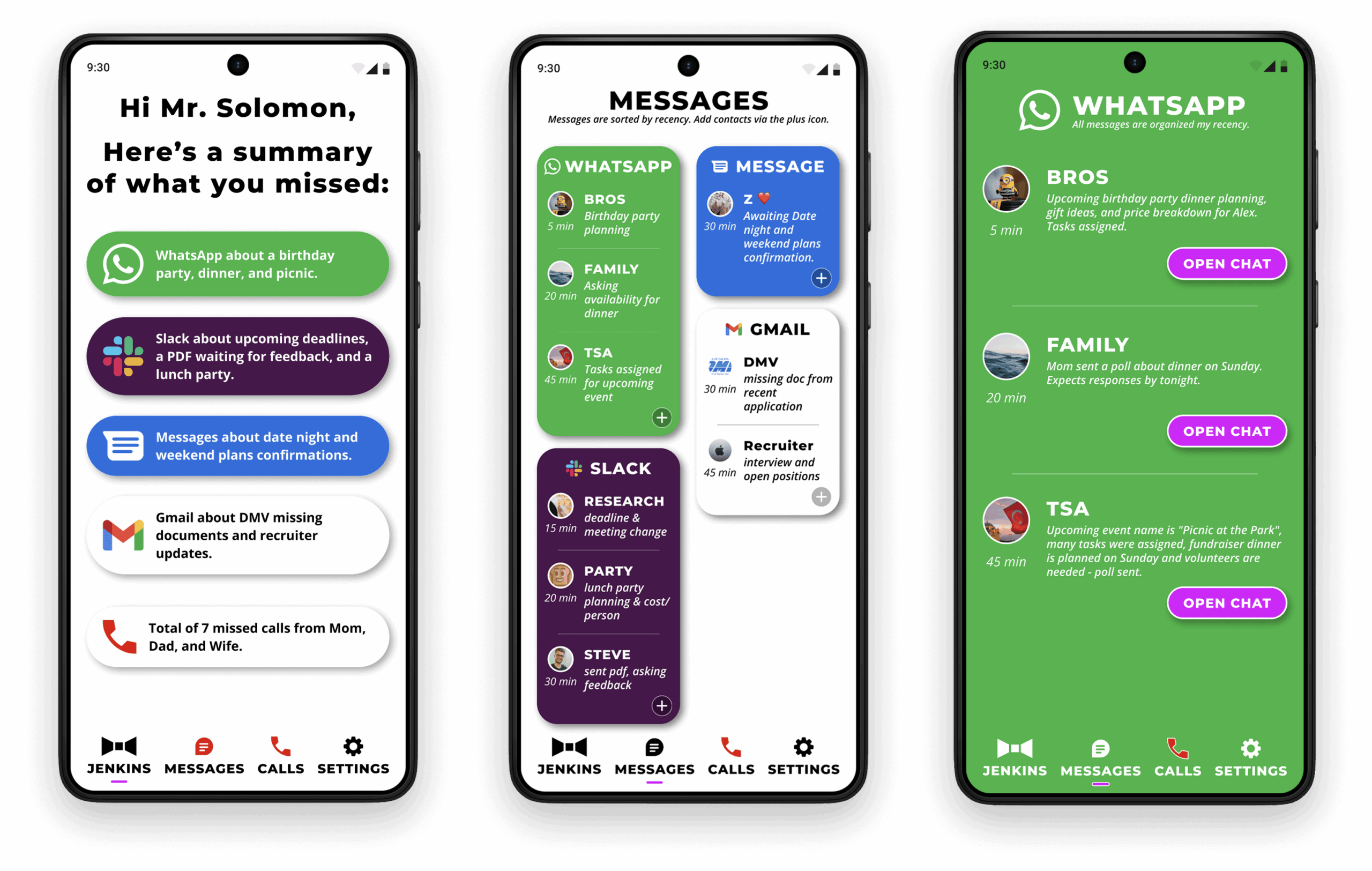
Content follows a funnel approach: general on the homepage, more detail on the messages page, and specific app-based messages last.
Participant Feedback
3/3 participants loved the funnel approach from general to detailed calling it 'natural,'
UI Consistency Across Apps
Colors match app icons for consistency. AI notifications are presented neatly with a 'Bento Box' layout.
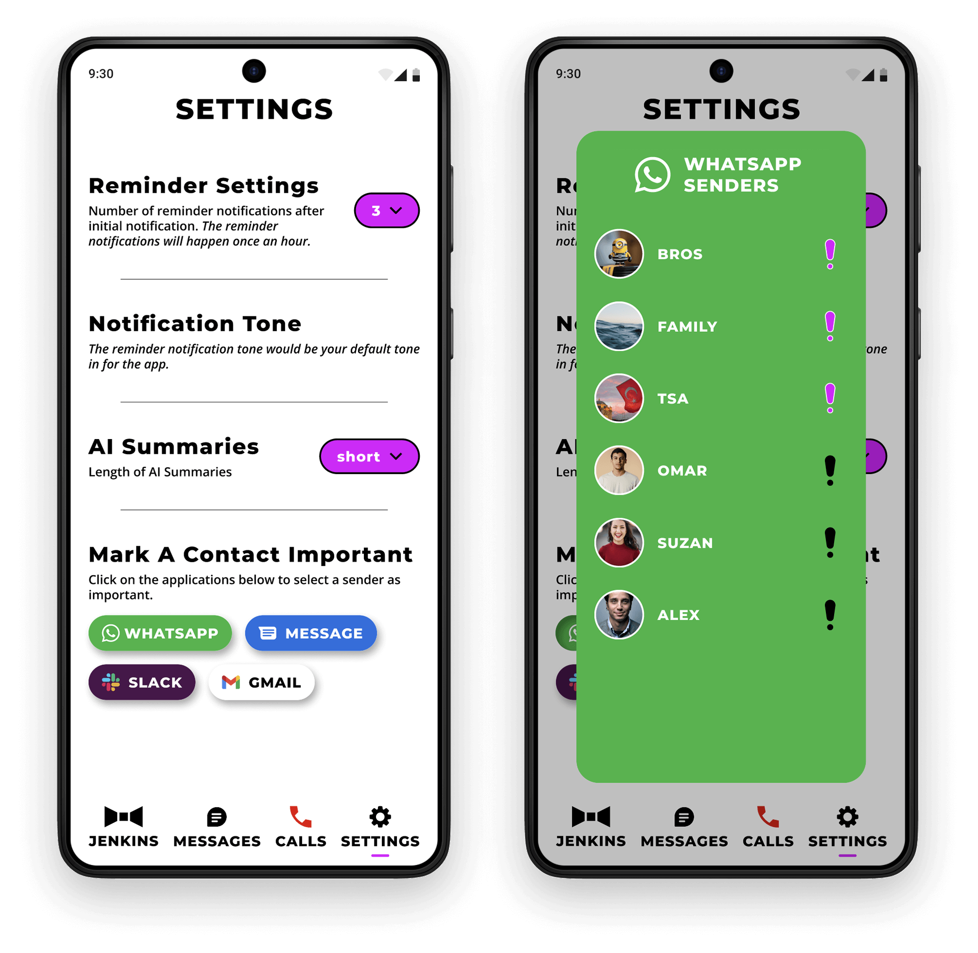
CUSTOM SETTINGS
Reminders on Your Terms
Automatic and Tailored
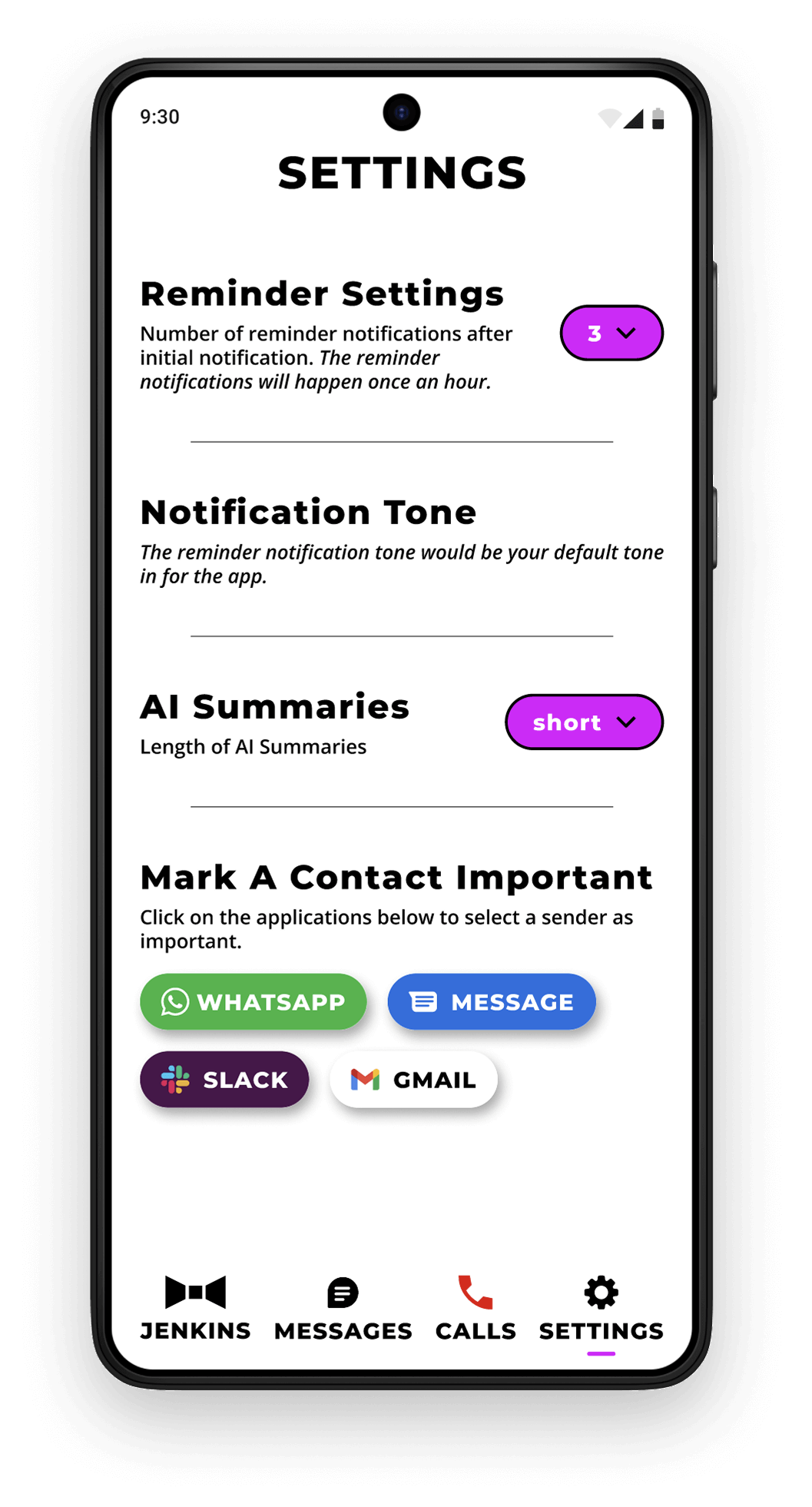
Users can customize notification frequency or choose immediate reminders, addressing issues of bad timing or forgotten messages.
Based on feedback, reminders now track frequency after the initial message per hour, not total per hour.
Lo-Fi Feedback
“My meetings tend to be long, I wouldn’t want to be bothered multiple times per hour on non-work related things.”
3/3 felt summaries were useful but wanted them slightly longer.
DESIGN CHANGES ⏏︎
3 Rounds To Get It Right
HOMEPAGE CHANGES
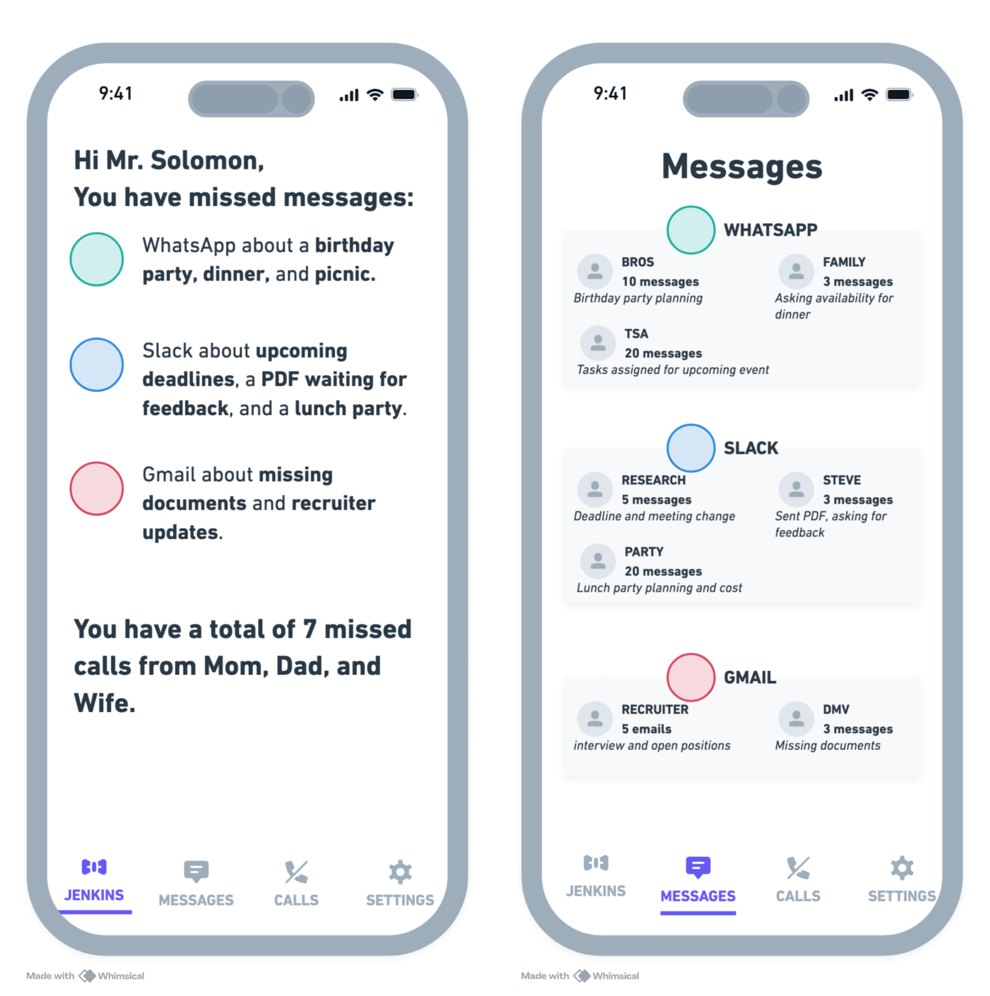
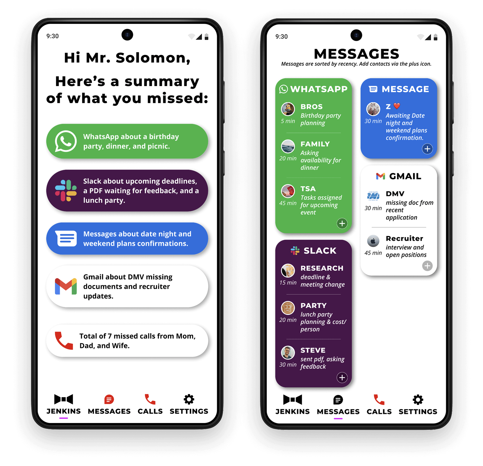
From 'OMG What A Mess' to 'My Personal Secretary'
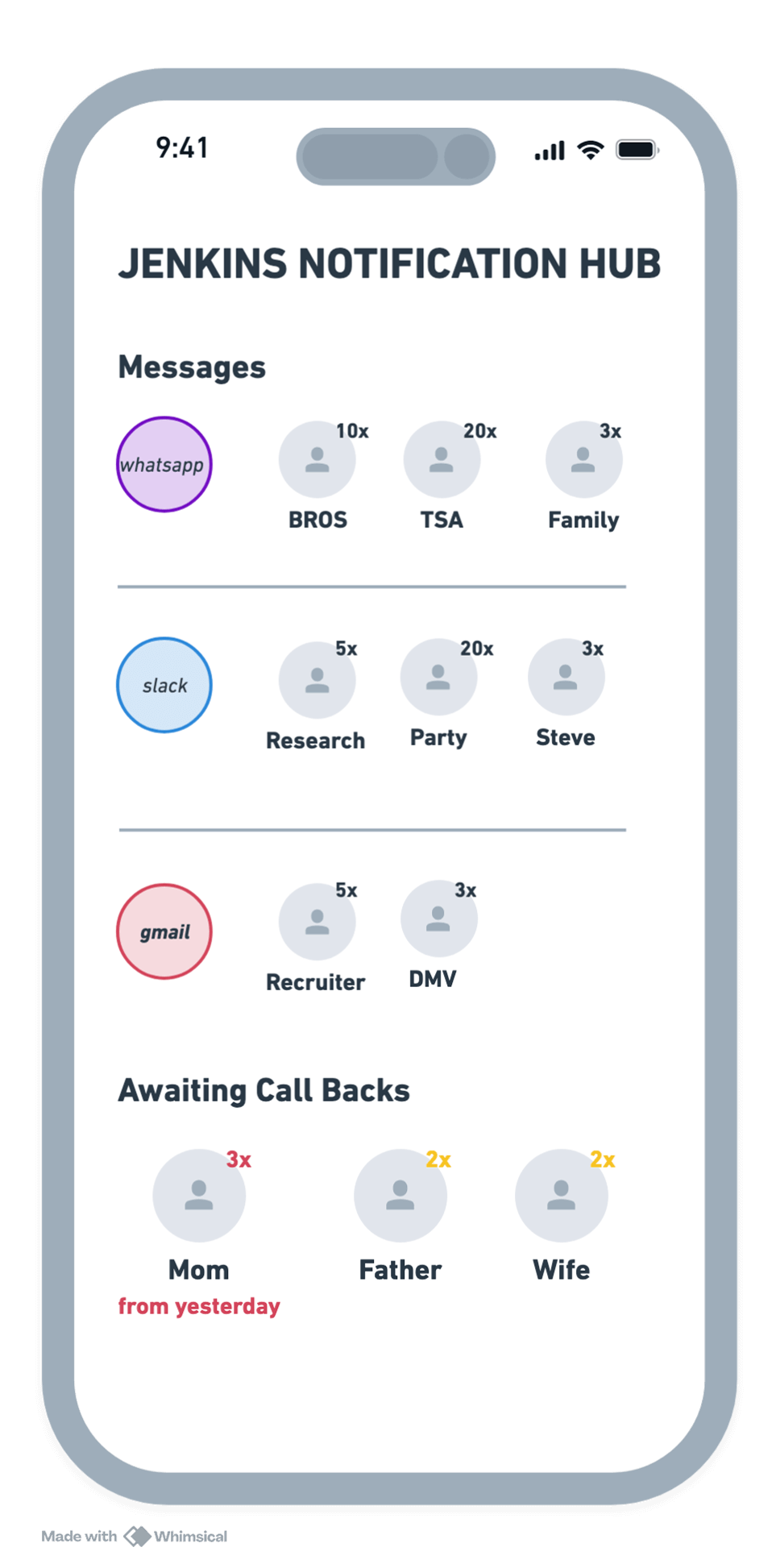
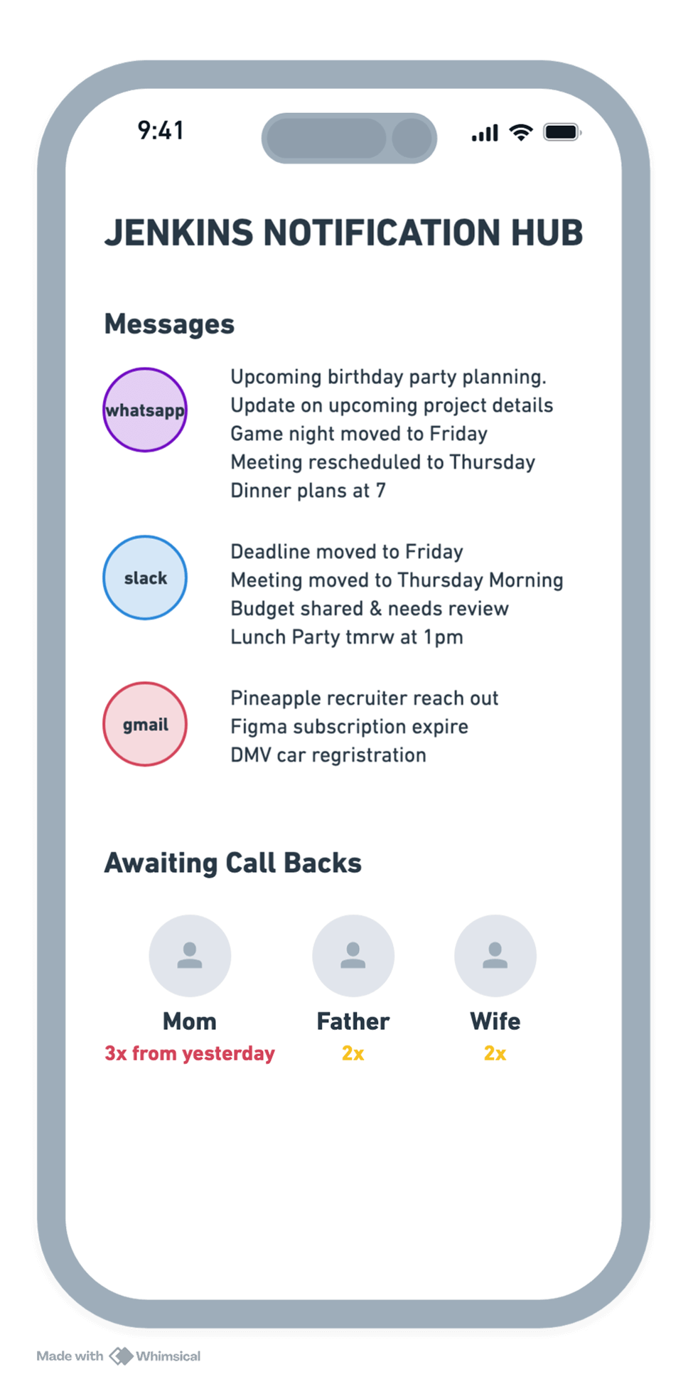
Through 3 rounds of testing, I evolved the interface from a cluttered notification list into a structured 'Content Funnel.' While V1 caused cognitive overload, the final V3 design successfully balanced AI-driven summaries with a 'General-to-Specific' navigation flow—leading one user to describe the experience as having a "personal digital secretary".
* Click on the arrows below to see more details.
✖ 3/3 said the summaries were “too much, too busy, too messy”
SPECIFIC APP NOTIFICATION SETTINGS
V2 Fixed V1 Problems But Introduced Another
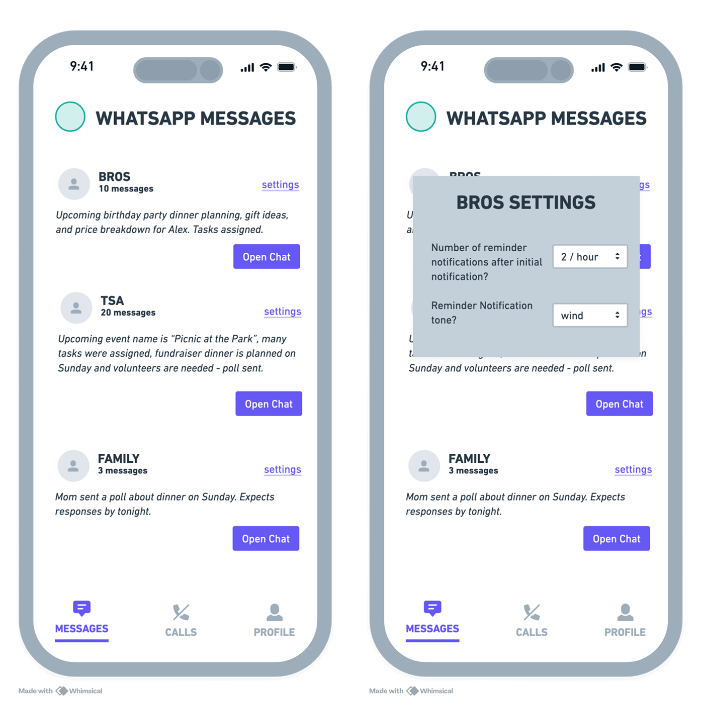
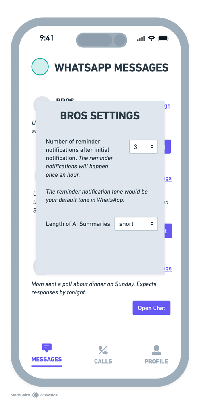
Early testing (V1) showed that users wanted more substance from AI summaries to feel truly caught up. While V2 solved the content depth, it introduced a new challenge: notification distraction. I iterated on this by moving from static alerts to 'User-Controlled Settings,' allowing participants to customize summary lengths and reminder intervals to reach their personal "sweet spot".
* Click on the arrows below to see more details.
✖ 2/3 participants thought the summaries were a bit short.
- ❝ Can the summaries be more detailed. ❞
- ❝ Summaries tend summarize the key ideas or main points as well. ❞
❤︎ ✖ 3/3 understood and appreciated reminder notifications, but had doubts on the success of it.
- ❝ My meetings tend to be long, I wouldn’t want to be bothered multiple times per hour on non-work related things. ❞
- ❝ Getting constant notifications per hour while working would be extremely distracting. ❞
When asked about a possible fix, they suggested it to be user controlled somehow.
- ❝ People would be are used to it (notification tone) and one more less thing to remember. ❞
USABILITY TEST ►
Testing Jenkins
PARTICIPANTS + USABILITY TEST DETAILS
Putting Jenkins In Front Of Real Users
Why
Earlier rounds measured preference, not whether people could finish tasks, so I ran scenario-based tests.
The usabilty test and results have been reflected in the final version of the JENKINS' prototype.
Participants
I tested my design with participants who matched my personas—busy individuals who often overlook notifications do to other responsibilities.
All participants names have been replaced with a random letter.
Participant D
Occupation: Data Science Manager
Technology Knowledge: High
Participant F
Occupation: Full Time Student
Technology Knowledge: Medium
Participant T
Occupation: Community Center Event Organizer
Technology Knowledge: Low
Usability Test
All usability tests were conducted on Zoom with consent to use cameras, record screens, and sessions for later observation.
Scenario 1
“You just finished a day with back-to-back [meetings, classes, discussions] and want to quickly get caught up on any important messages and message them back.”
Scenario 2
“After a long day, you JUST remembered the notification from an [Apple recruiter, colleague, team member for class]. Find it.”
Scenario 3
“You want to set your close friend Omar as an important sender for Whatsapp in Jenkins. How would you do that?”
Post Usability Test Questions
1. On a scale of 1 (never use) - 5 (would download it now), what would you rate this design?
- 3
- 4
- 5
2. What do you think this design needs to make it even better?
- "A way to know when a message has arrived. A way to order messages because it seems like it's missing."
- "A sort of widget would be nice."
- "Overall it's really good, but I had trouble adding someone as important. Maybe a way to make that faster."
3. "What do you tend to do to remind yourself to return back to people?"
- "I don't have a method, I just remember it. All of my devices are connected, when I receive a notification and it's important, I drop everything and deal with it."
- "I tend to see messages on my lockscreen at the wrong times, so 1 immediately take a screenshot of it."
- "I write it in the small notebook that I carry with me."
RESULTS + UPDATES
What Still Needs Fixing
Although all tasks were completed, participants faced issues. I prioritized message delivery and “important sender” problems due to time limits.
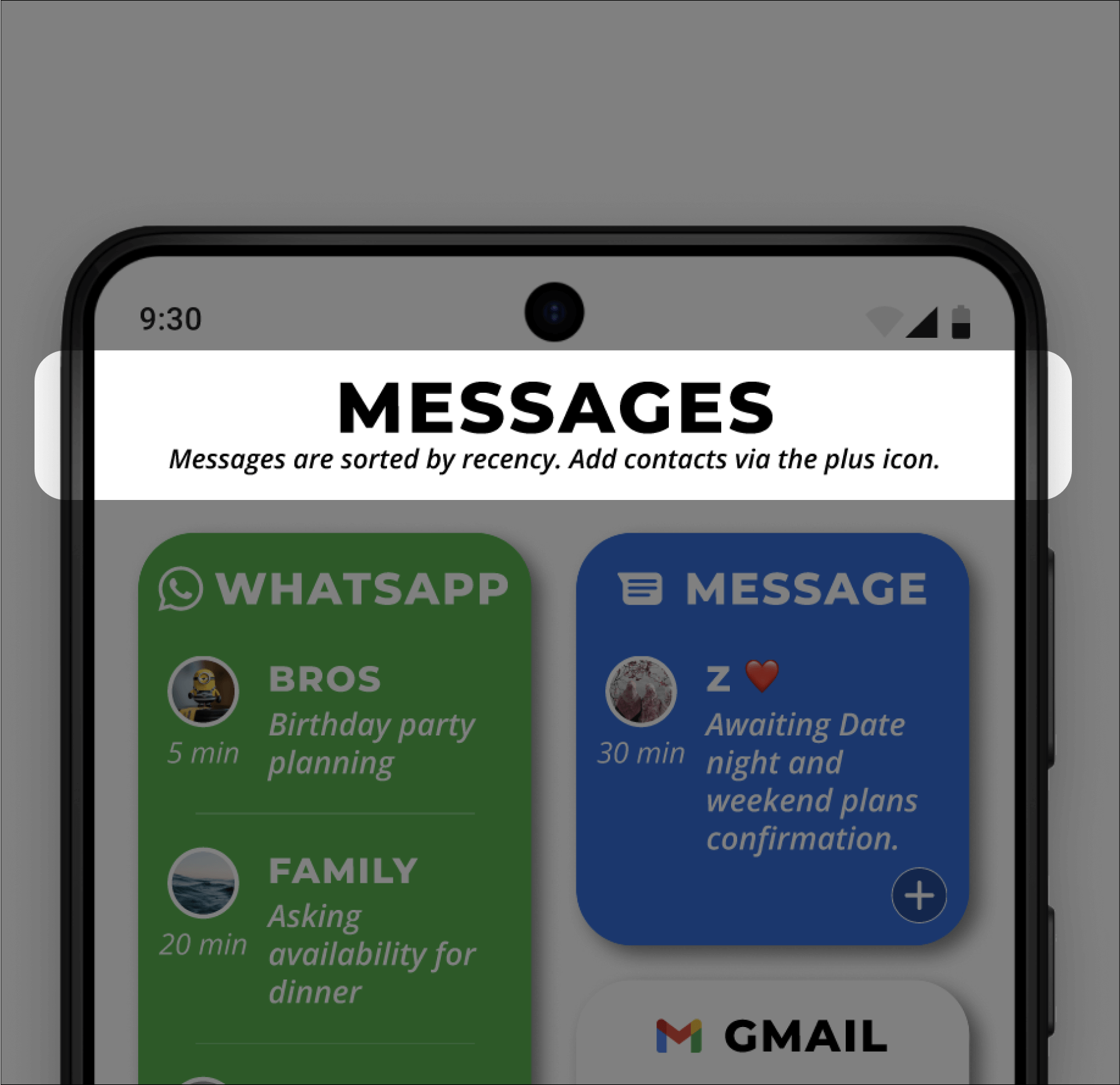
✖ 2/3 wondered about the order of messages
✖ 2/3 seemed bothered in going to the chat source.
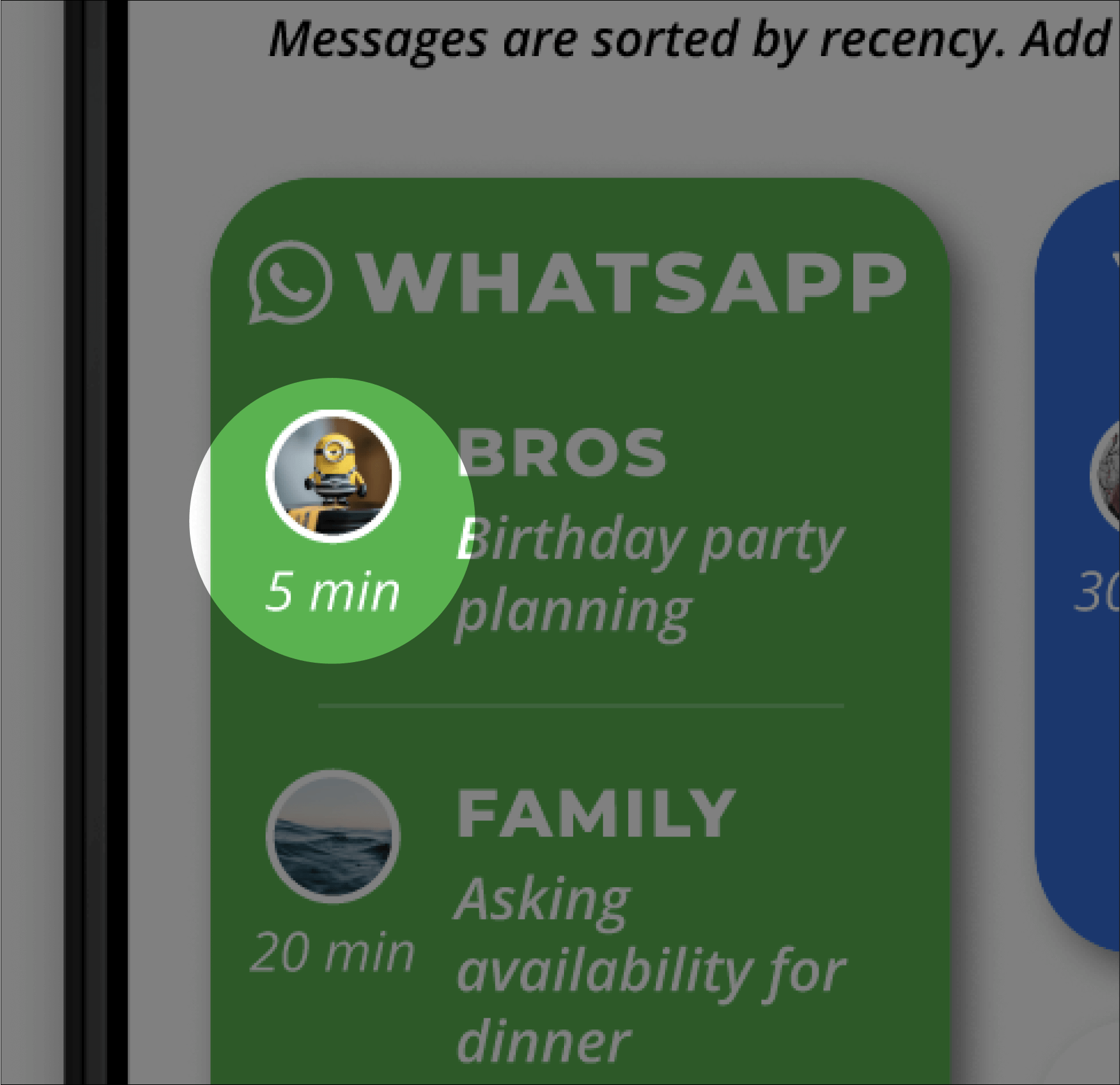
✖ 2/3 asked "When did this message come?"
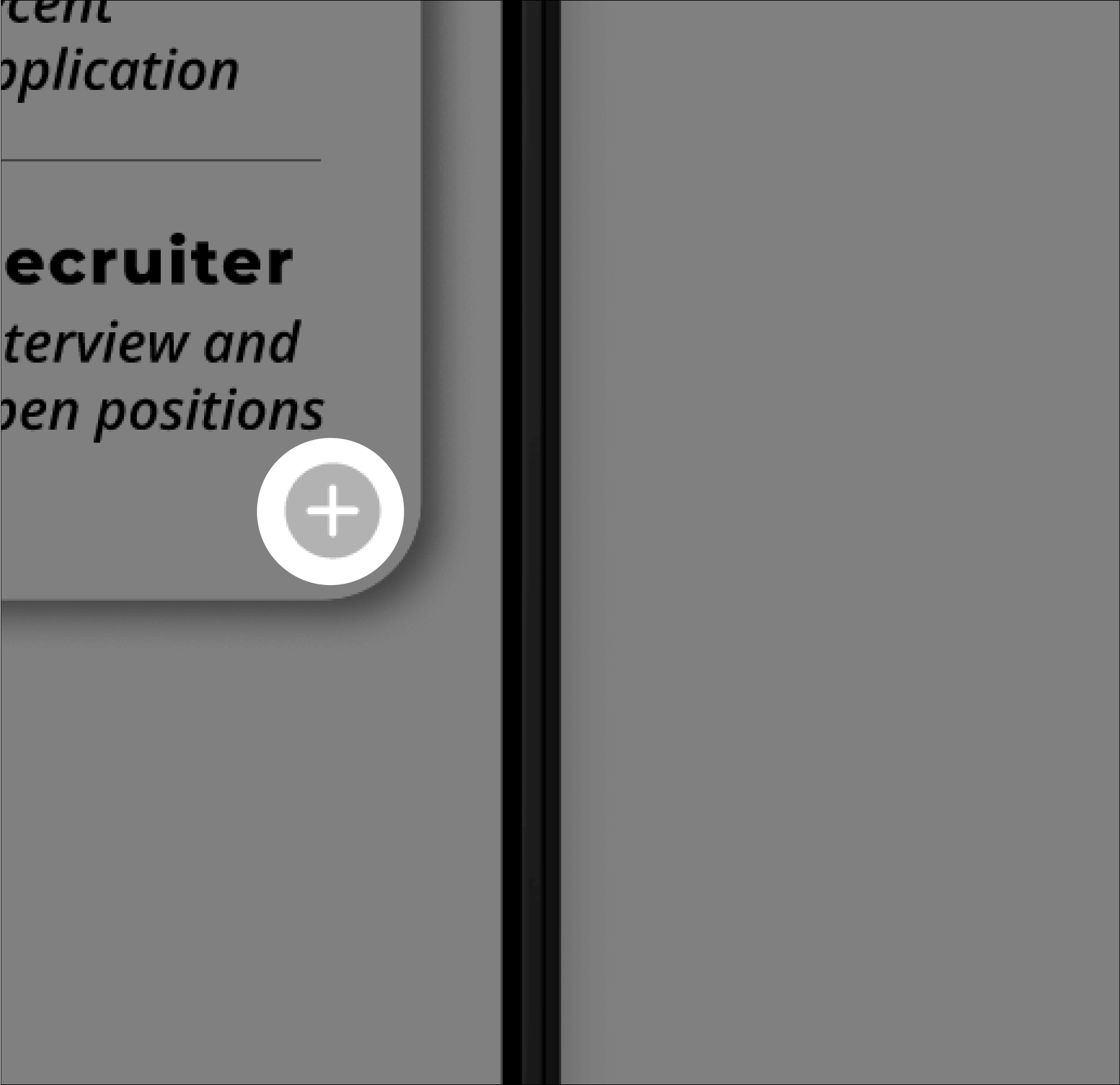
✖ 2/3 took longer than expected to add an "important sender"
Message Recency
Recent messages appear at the top with timestamps.
Message Time
Each contact shows the last message time.
Quick Add Contact
A bottom-right button lets users mark contacts as important.
Recieved Feedback
Overall Score: 12/15
"Overall it's really good, but I had trouble adding someone as important. Maybe a way to make that faster." ❤︎
Participant D
"A sort of widget would be nice." ❤︎
Participant F
“This feels like I have a secretary named Jenkins.” ❤︎
Participant T
REFLECTION ⬅
Looking Back
What I Did Well
Research Led The Design
Memory research gave me recall versus recognition, and that rule shaped how Jenkins surfaces missed messages instead of asking users to remember them.
Risks Tested Early
Before designing screens, I tested whether iOS and Android could support the same automation. That led me to design for Android and cut iOS, and I found no tool covering email, messages, and calls together.
What We Would Do Differently
Retest, Then Fix
I’d retest the fixes I shipped (message order, last-message times, quick-add button) and reduce the friction of jumping to the original chat, since 2/3 testers were bothered by it.
Expand Where Jenkins Lives
I’d design iOS around semi-automated flows, then add a home-screen widget and mark-as-important from the source (Gmail plugin, incoming call, new message).
What I Can Do Later
Thin Evidence
Three participants from a 20-person screening survey show patterns, not proof. The archetype came from my experience and about 50 public posts, so interviews would confirm it.
Untested Conditions
Zoom sessions were calm, the opposite of the distracted setting Jenkins is built for, and no study measured fewer missed replies or less relationship strain.