
"New" Orontes
The Shelf Said One Thing. The Screen Said Another.
A shopper found Orontes on the shelf, searched for it online, and landed on a site that didn't match: different fonts, colors, tone.
I rebuilt the UI around the label itself.
That consistency helped close 10 retail partnerships.
Scroll Down ⬇
UI Redesign Visual Design System Design Systems Thinking.












PROJECT METADATA
The Basics
ROLE
UI Designer
MEMBERS
Suleyman Sarigoz (me)
Murat Hokka (CEO)
Shayne Reed (Brand Manager)
INDUSTRY
Retail
TIMELINE
2 - 3 weeks
TOOLS
Figma
Claude
PROJECT CONTRAINTS ◼︎
Working Within Real Limits
COMPRESSED TIMELINE
2 Weeks
2 weeks, start to finish, for a startup with almost no internal design resources.
NO FORMAL RESEARCH PROCESS
Direction > Discovery
Design decisions were driven by the marketing director's direction and the product's own packaging, not original user research.
MISSING INFORMATION
Info I Wish I Had
An early card sort didn't have time to shape the structure, and I didn't learn until after launch that Orontes had no developer, both details that would have changed how I prioritized from day one.
COMPANY BACKGROUND ♣︎
One Product, Big Ambitions
COMPANY BACKGROUND
Who is Orontes?
Company Goal
Disrupt the dairy market with a locally-sourced, minimally processed product offering superior creaminess and richness.
Compete with current leaders in the market.

New Company, 1 Product
A small company with only 1 released product based in Pennsylvania.
No online presence, no social media, barely any instore product.

PROBLEM & SOLUTION ✖︎❤︎
Fixing A Brand That Didn't Match Itself
THE PROBLEM
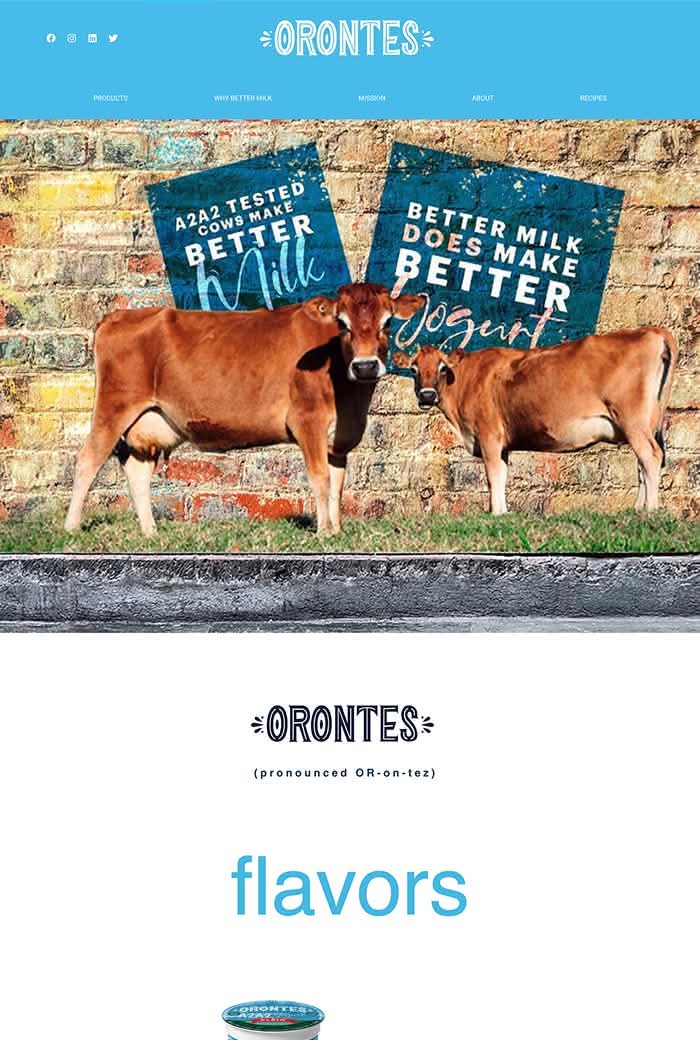
1 Brand, 2 Different Looks
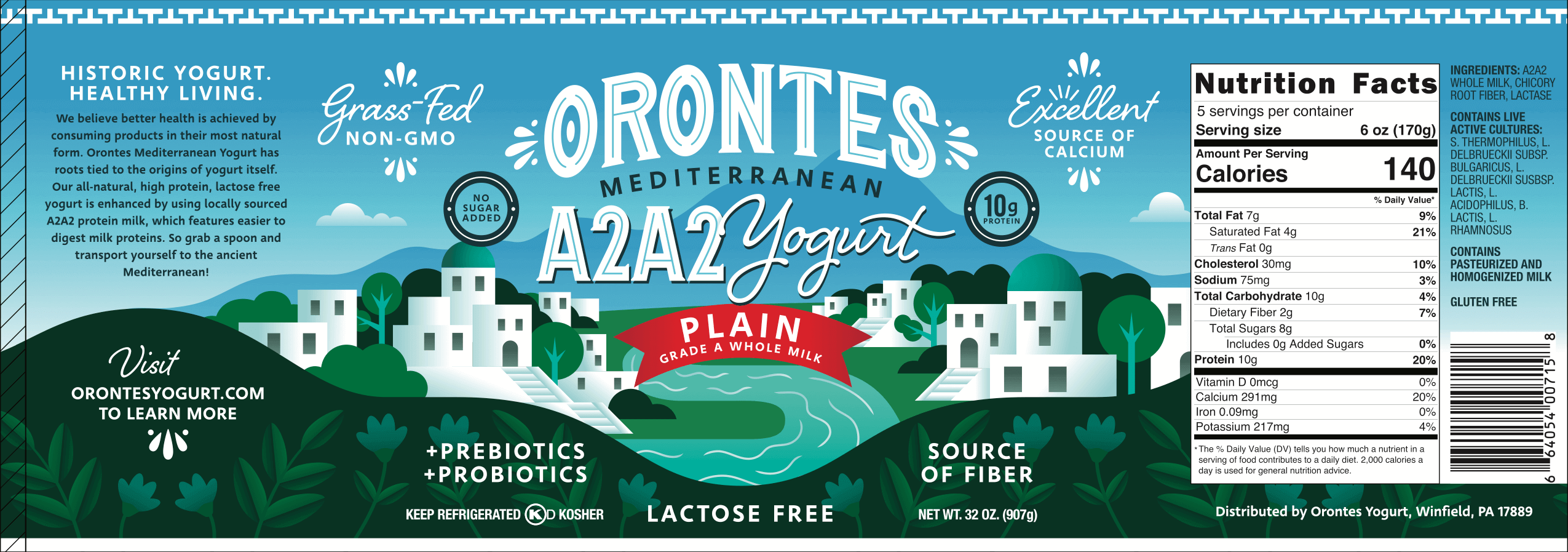
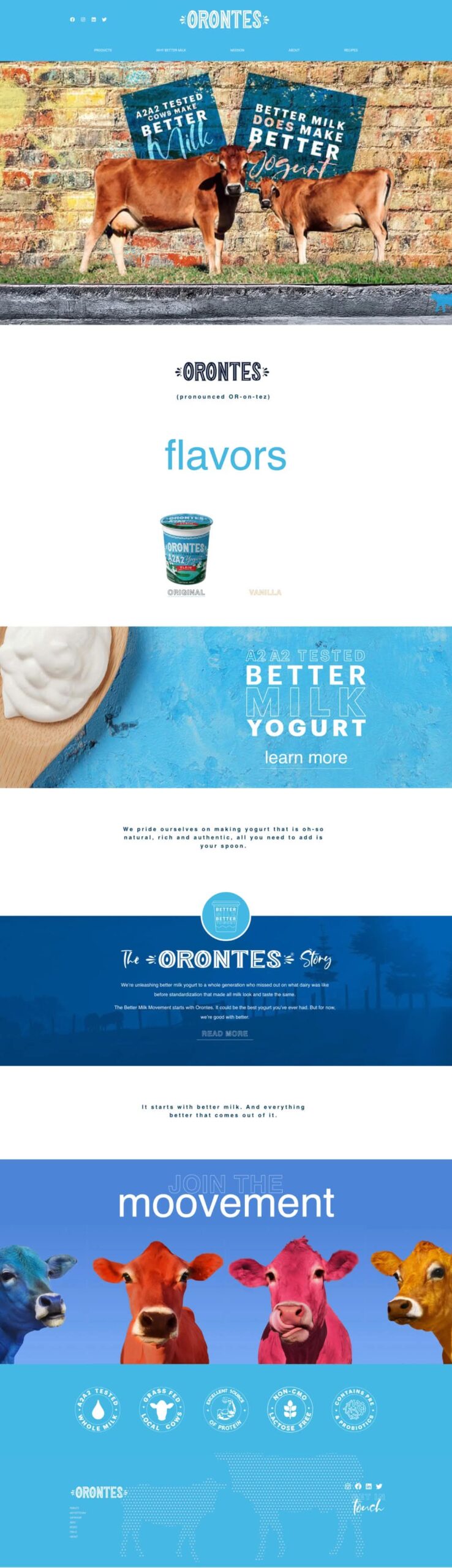
Orontes' website looked nothing like its product. A shopper who found the yogurt on a shelf and searched online would land on a site with a different visual language: different fonts, colors, tone. Trust and recognition took a hit before anyone read a word.
Product Label
Old Website Design
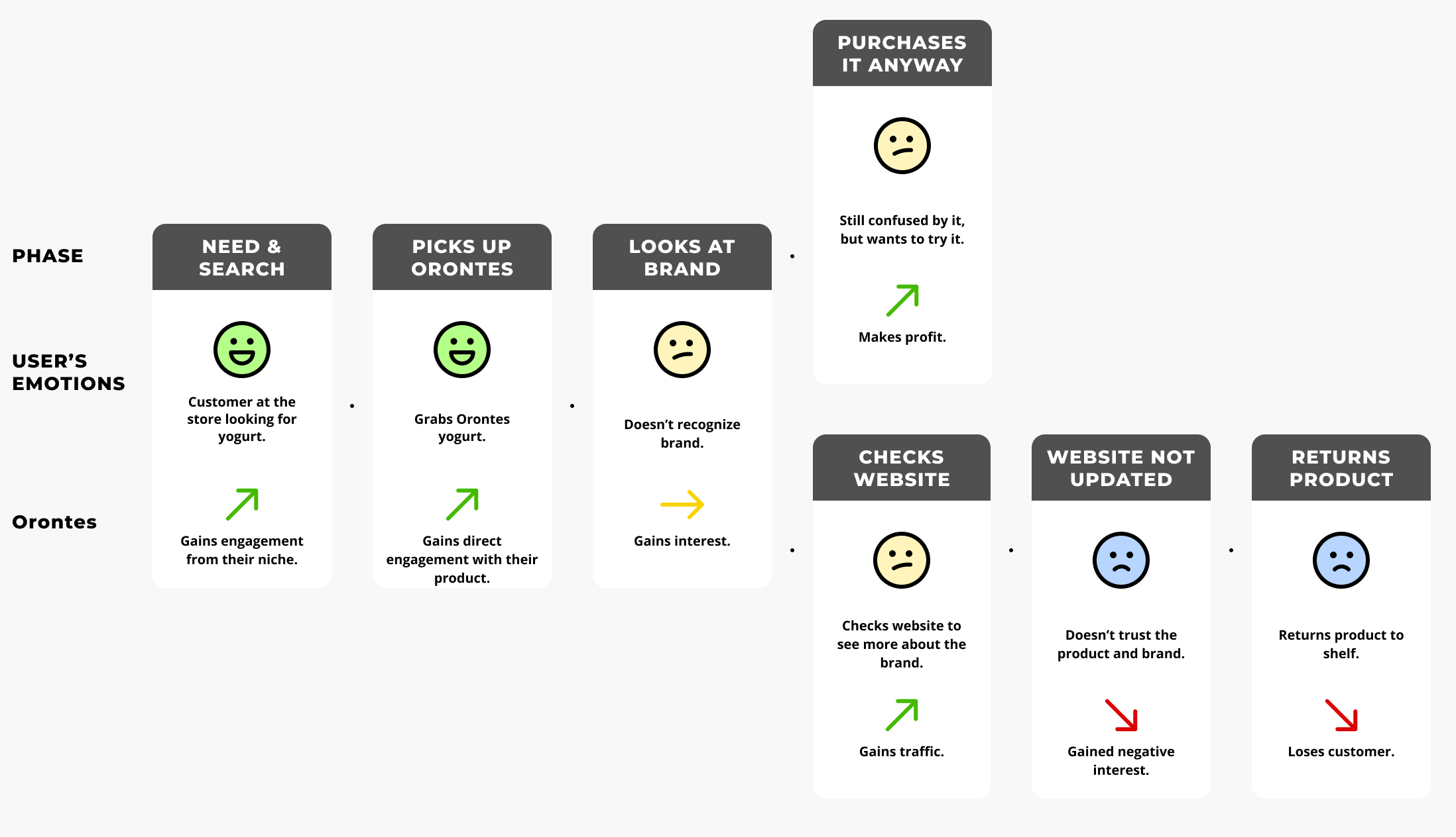
USER JOURNEY MAP 1
A Disaster Waiting To Happen
This map shows the likely path a shopper takes between discovering Orontes' product and encountering its website, and where that path breaks down. It's based on reasoned assumptions, not user research or testing.
THE SOLUTION
Building The Brand From The Label Up
Starting With What Already Worked
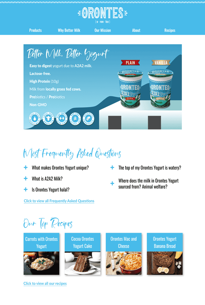
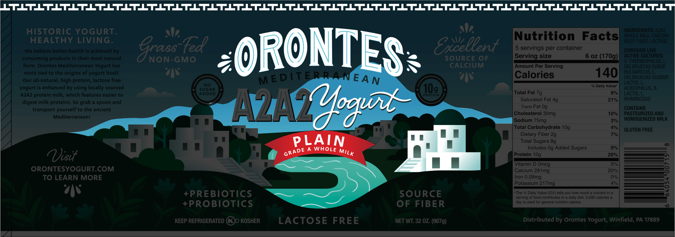
Instead of designing a new identity from scratch, I built everything outward from the product label itself, pulling in its fonts, colors, and imagery like the mountain, the river, and the decorative ribbon.
One System, Every Touchpoint
That same visual system carried across the website and into a booklet covering the company's history, products, and pricing, giving Orontes a consistent brand across every touchpoint: on shelves, online, and in the room with potential retail partners.
Consistency That Closed Deals
That consistency played a part in securing 10 retail partnerships.
Product Label
Old VS "New" Orontes
DESIGN CONTEXT ⬥
Inspiration & Direction
TARGET AUDIENCE
Who Orontes Is Designing For
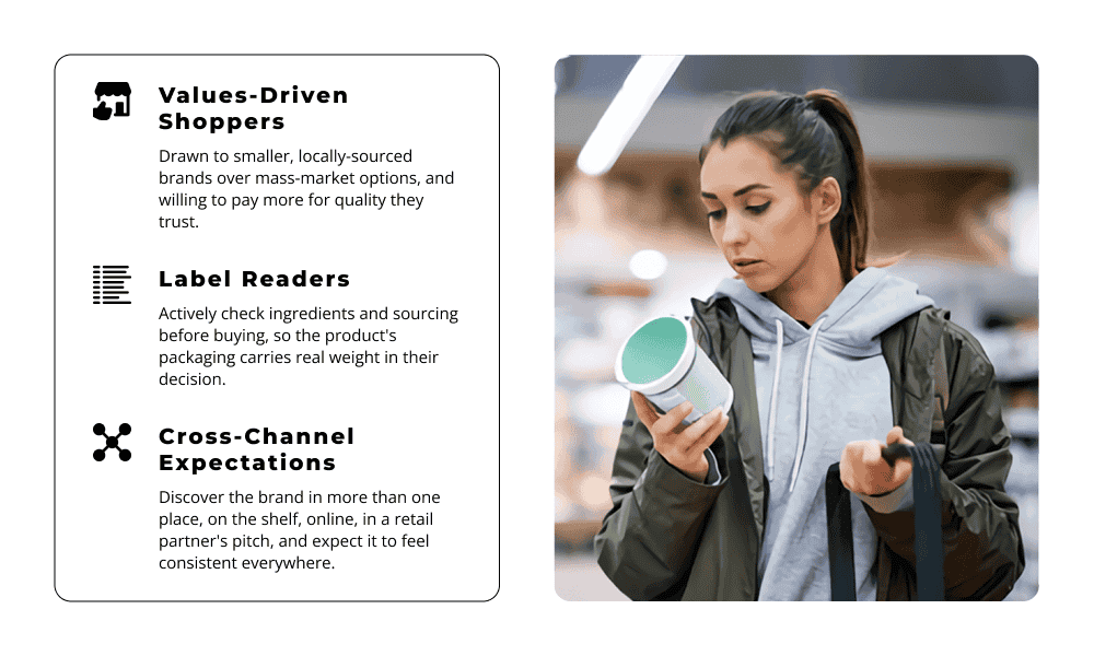
Customer insights provided by Orontes' marketing director; not independently researched for this project.
DESIGN INSPIRATION
Starting With What Customers Already Trust
The product label was the primary design inspiration, since it's the one thing customers already see on the shelf.
DESIGN CHANGES ⏏︎
From Mismatched To On-Brand
HOME PAGE
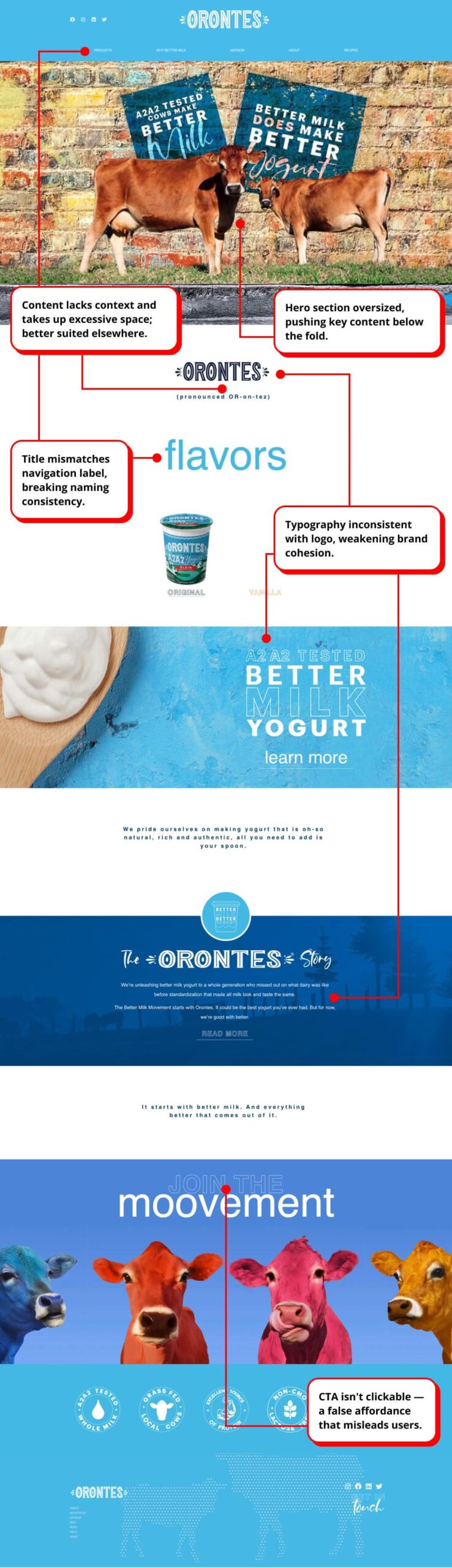
Before: Off-Brand
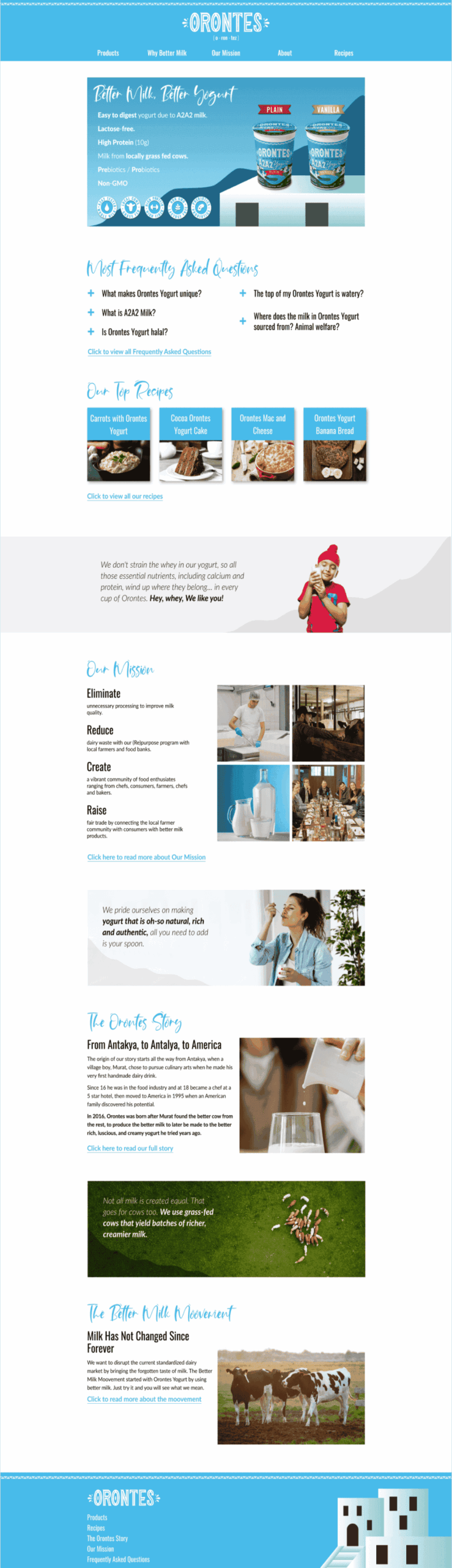
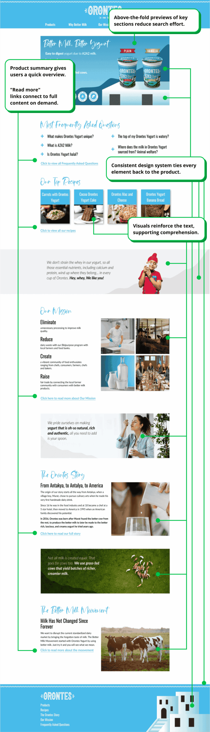
After: On-Brand.
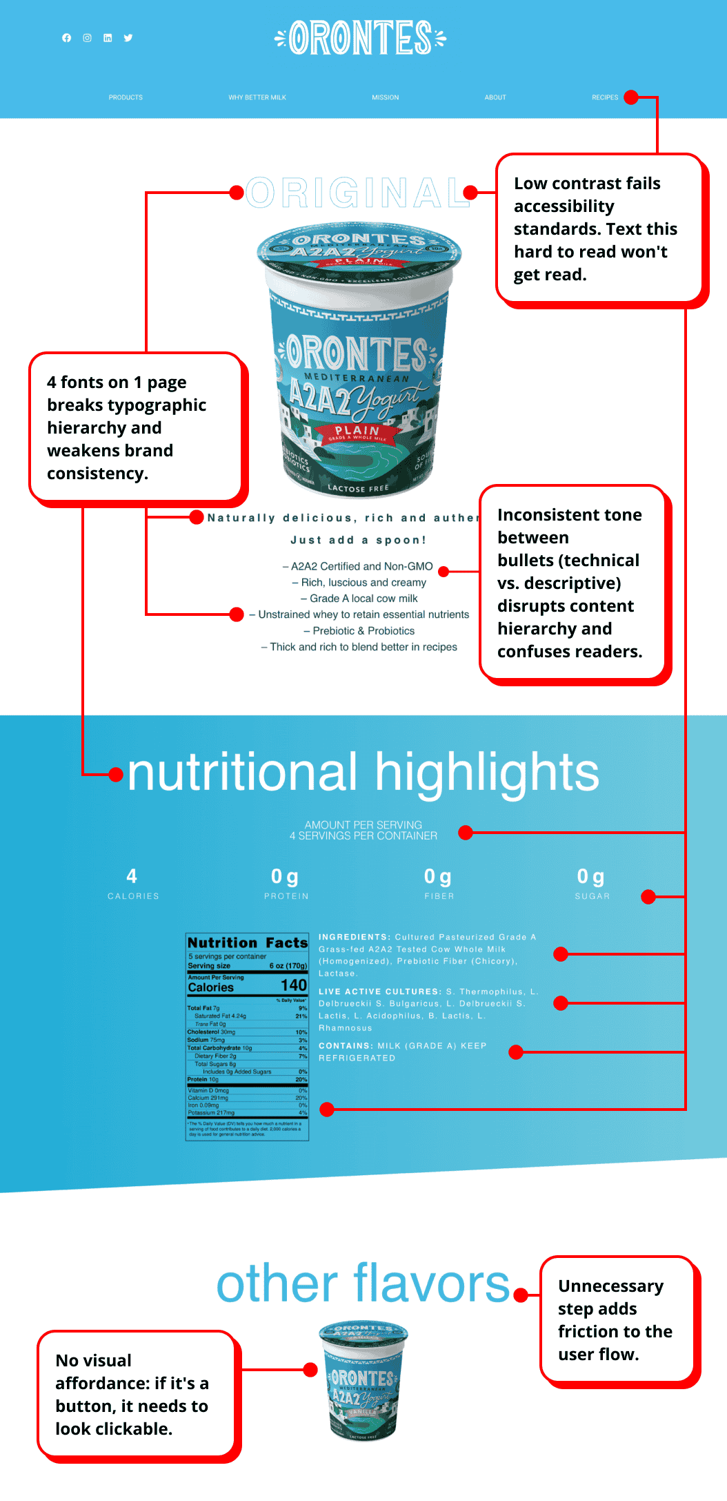
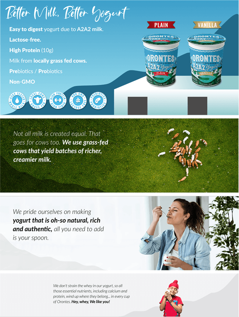
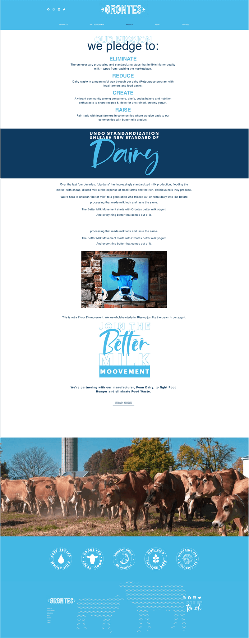
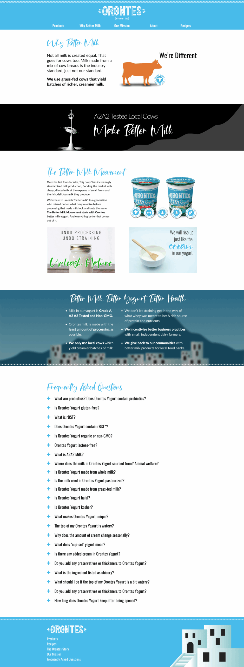
The old homepage buried key content below an oversized hero, mixed inconsistent typography and labeling, and gave users no quick way to see what Orontes offered. The redesign surfaces key sections above the fold, ties every element back to the product's design system, and gives users a clear path to more detail.
PRODUCT PAGE
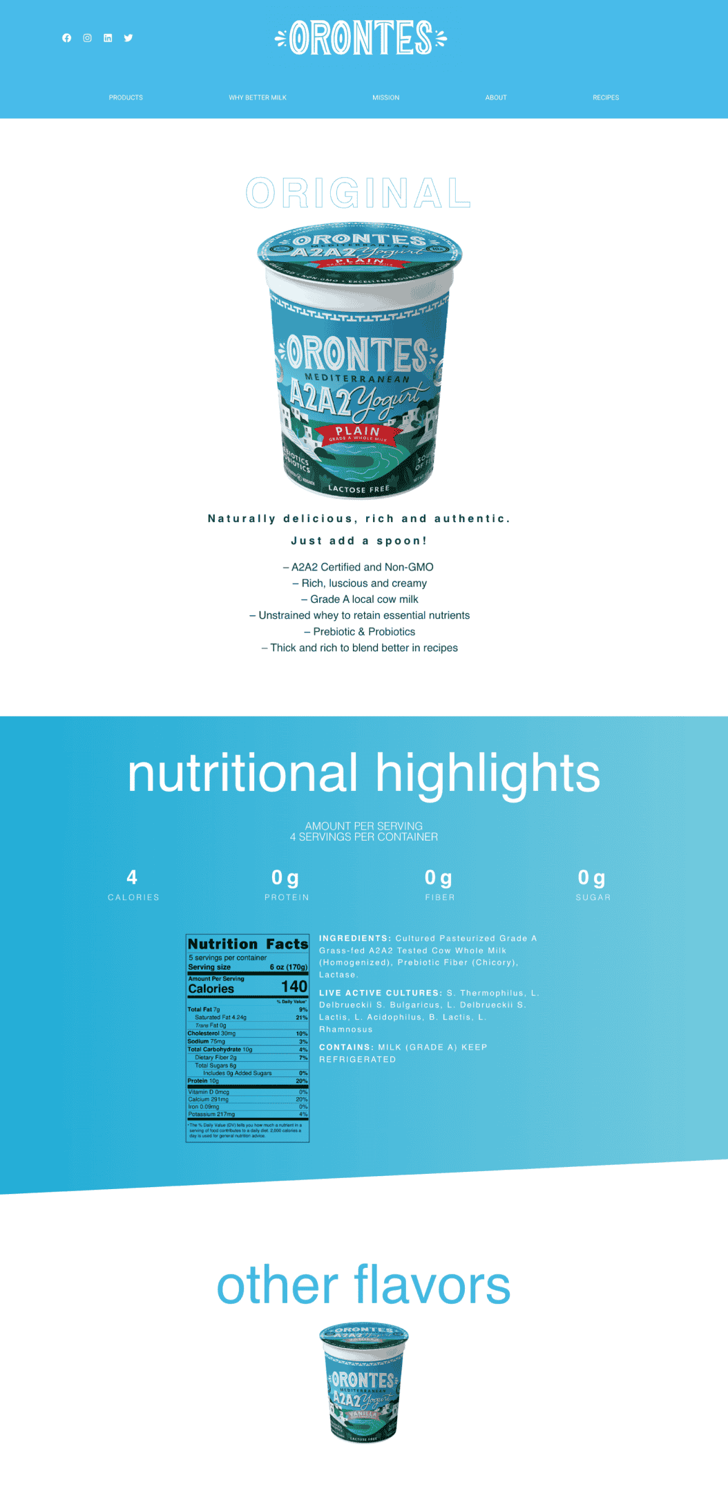
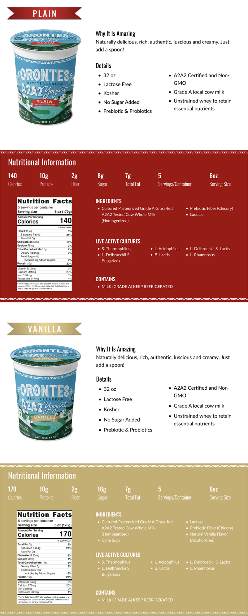
Before: Cluttered
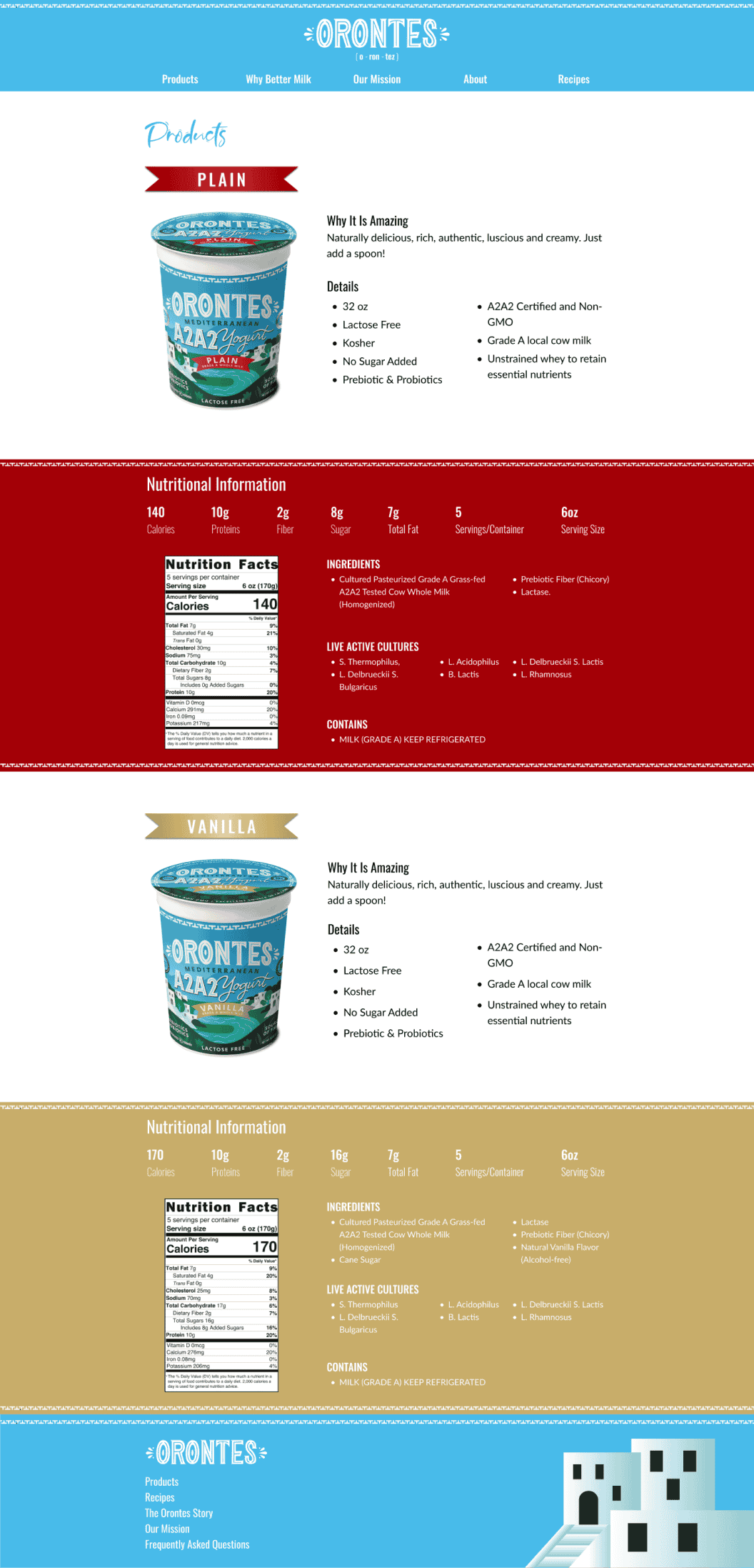
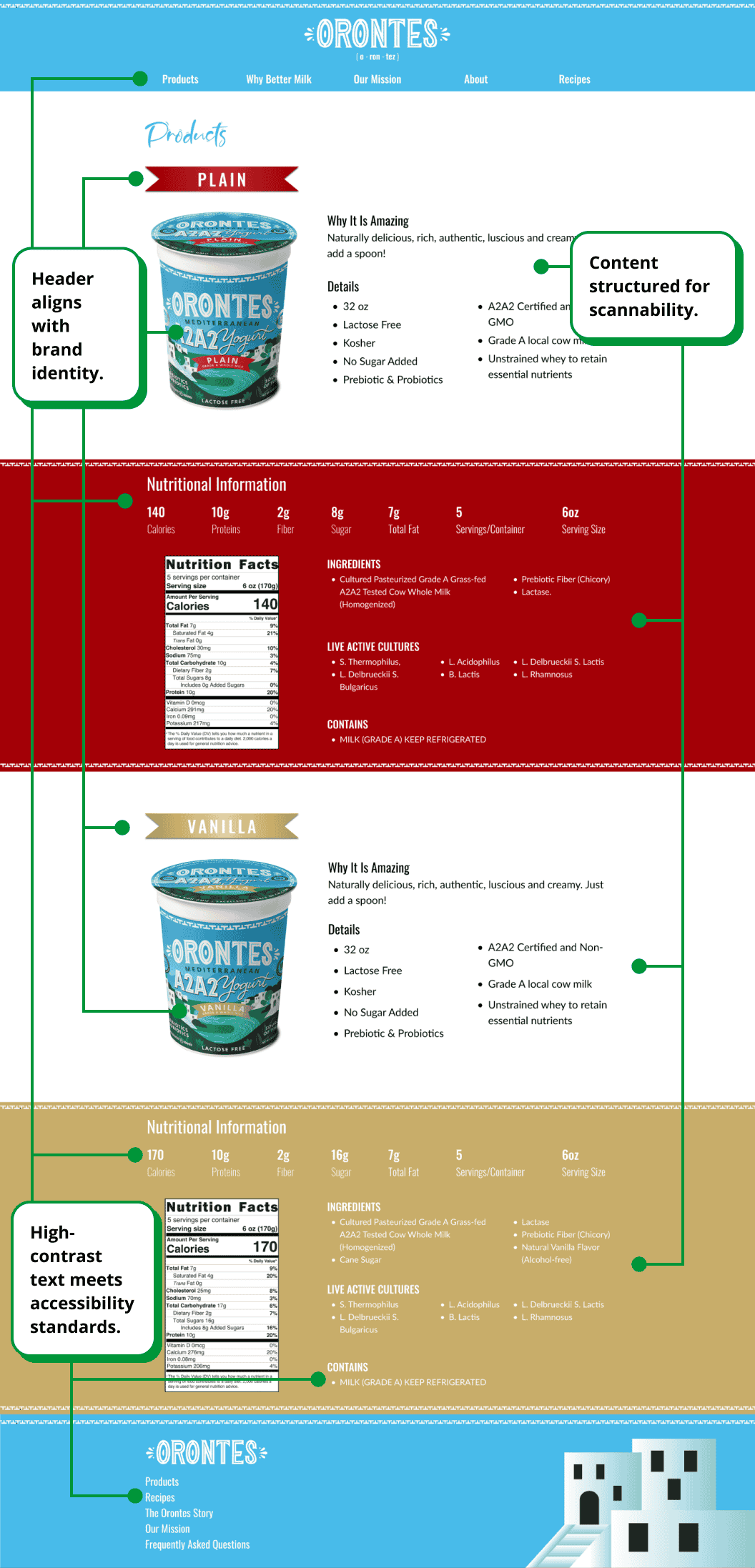
After: On-Brand
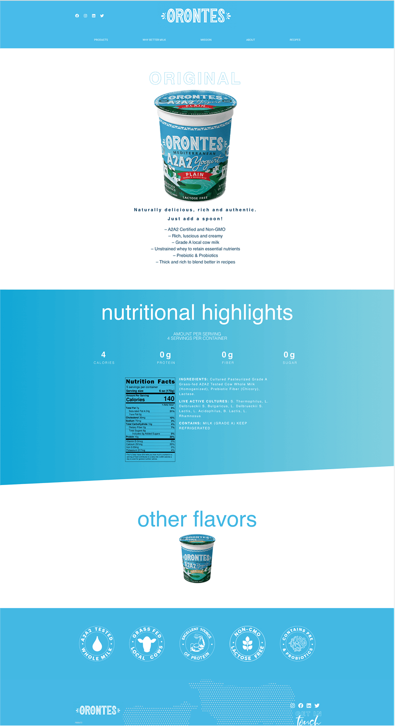
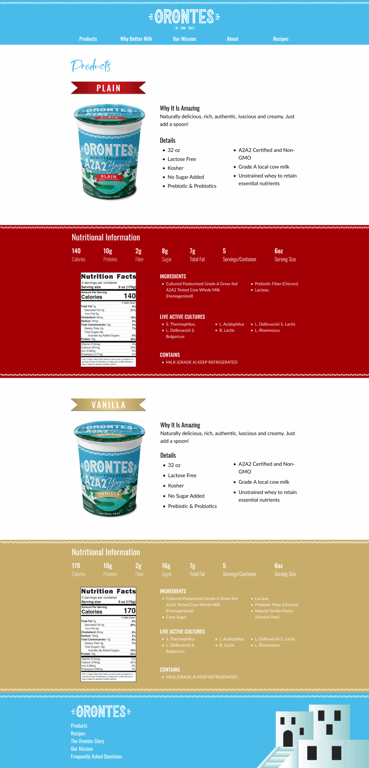
The old product page buried its content behind accessibility issues, inconsistent typography, and unclear interactions. The redesign fixes each one, pulling every element back into the same visual system as the product label.
ABOUT US PAGE
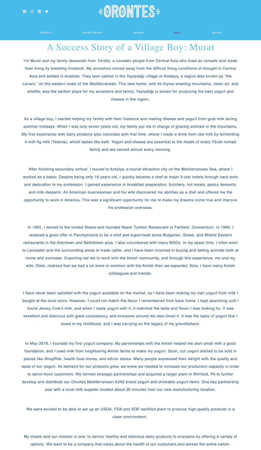
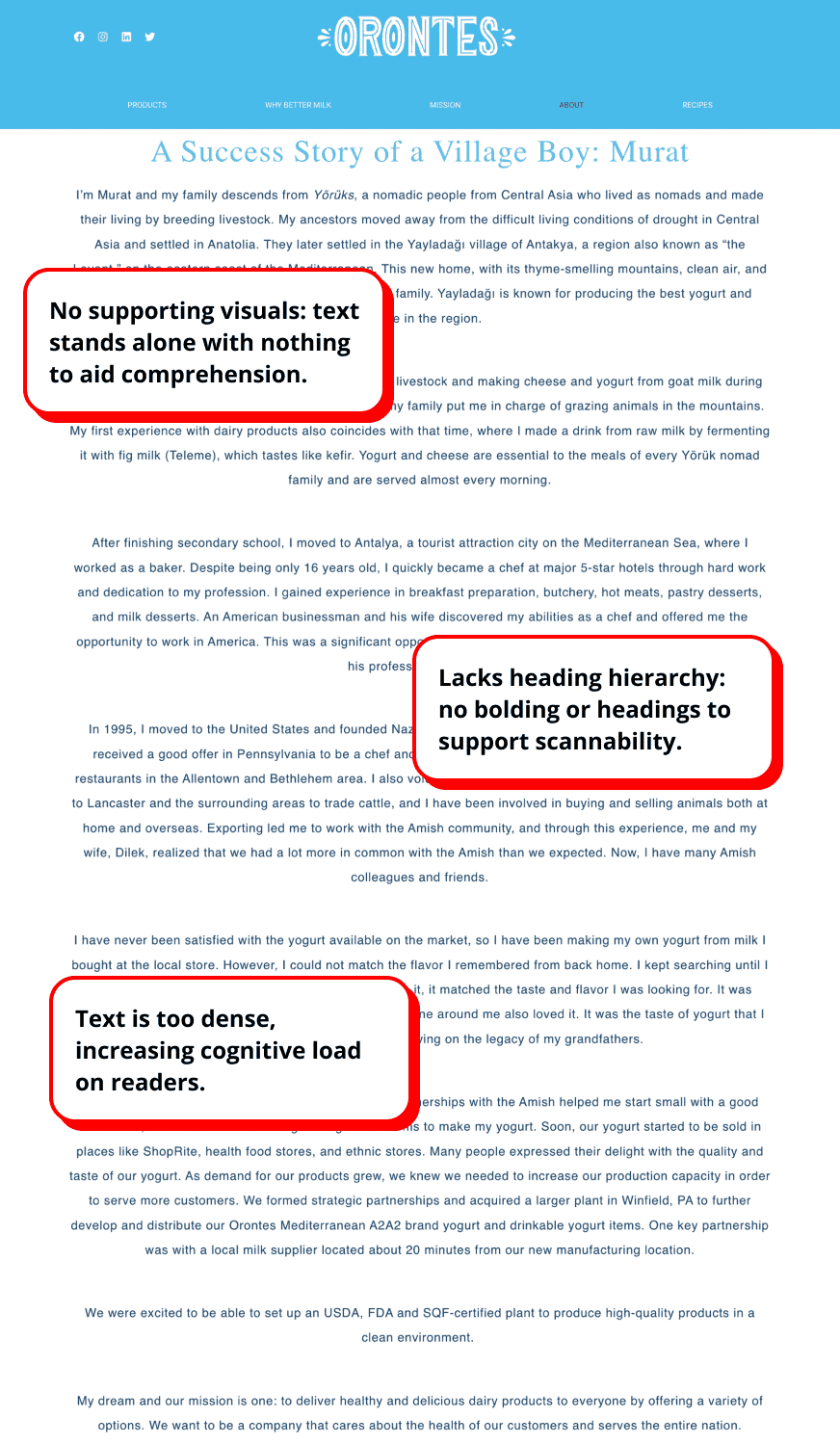
Before: Wall of Text,
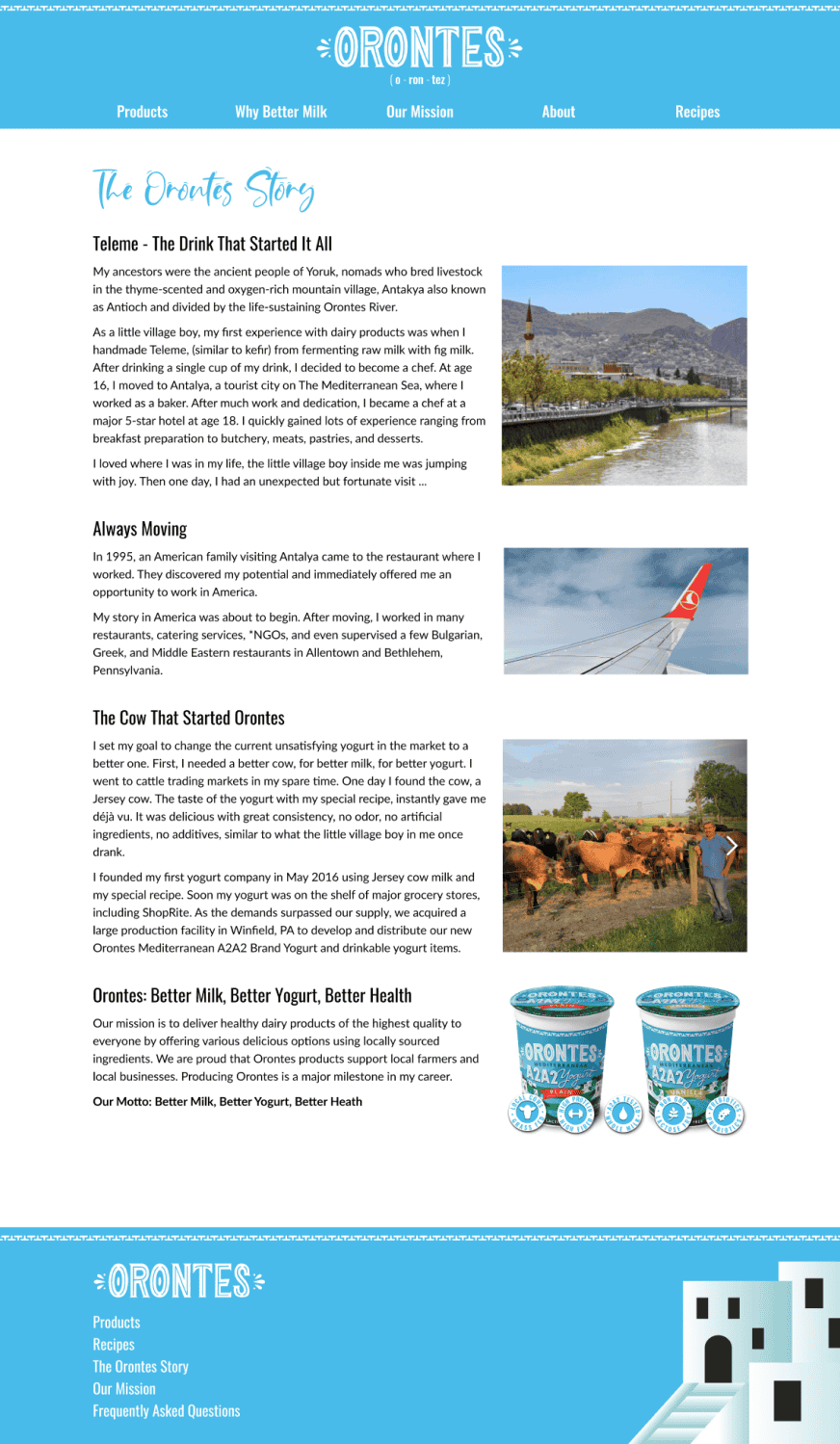
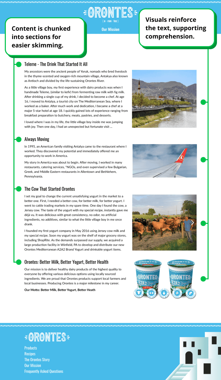
After: Visual & Skimmable
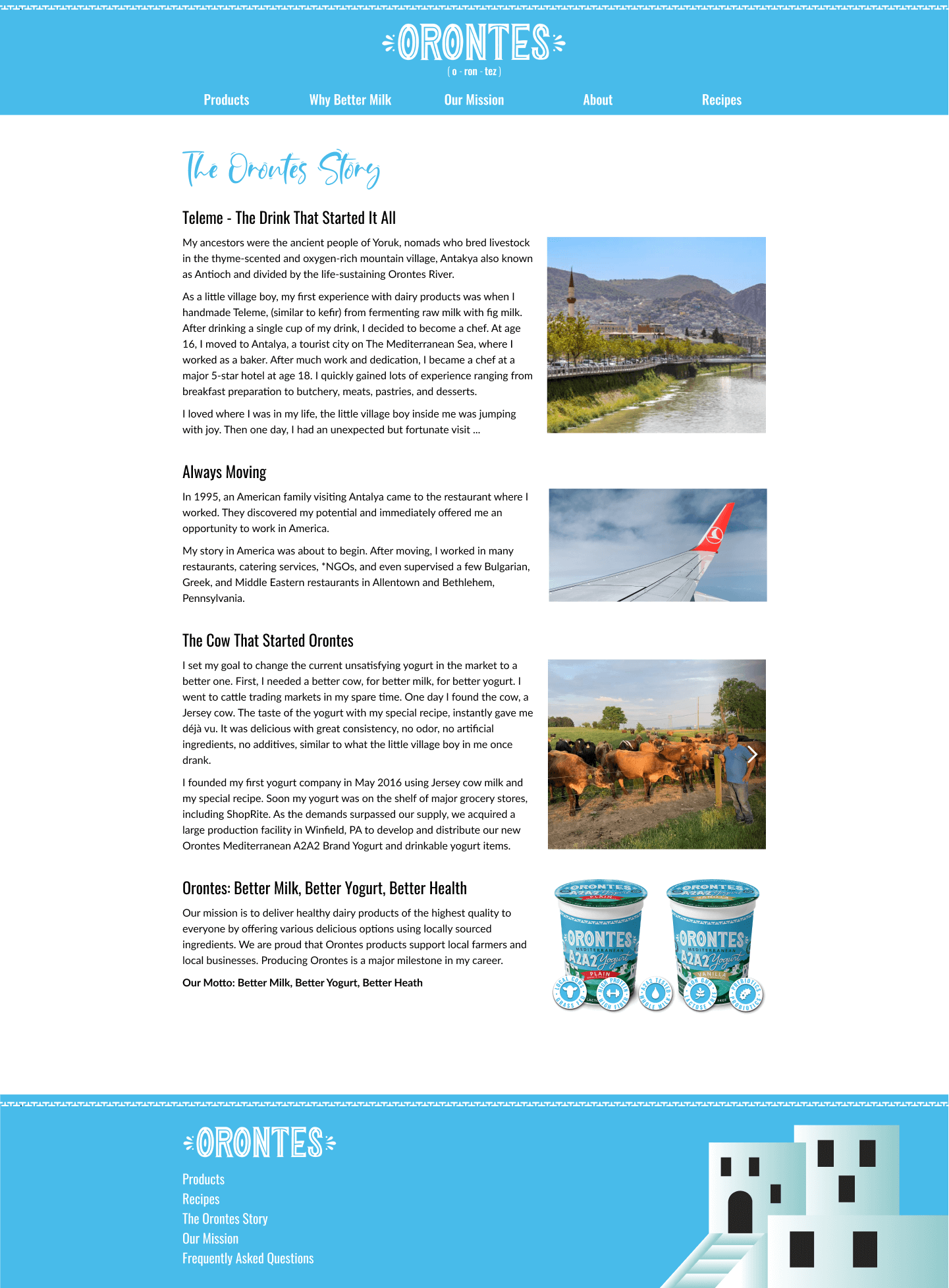
The old page buried its content in dense, unstructured text with no visuals to break it up. The redesign chunks content into sections and adds visuals that reinforce the message, cutting cognitive load and making the page easier to skim.
FROM LABEL TO BRAND ★
Product Label → Website → Booklet
LABEL ELEMENTS APPLIED
What The Label Gave The Site
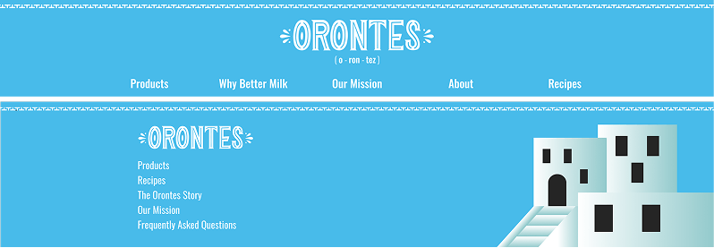
Specific elements from the label were incorporated into the redesign to keep the site consistent with the product.
Font
Used across headers and body copy so the site reads as the same brand the moment you land on it.
Mountain imagery
Shows up in banners and section dividers, tying back to the product's local, Pennsylvania roots.
Decorative Ribbon
Repeated across page headers as a small but consistent link back to the packaging.
Buildings Motif
Worked into illustrations to reinforce the small-batch, local feel of the brand.
THE RETAIL BOOKLET
Beyond The Website, The Booklet
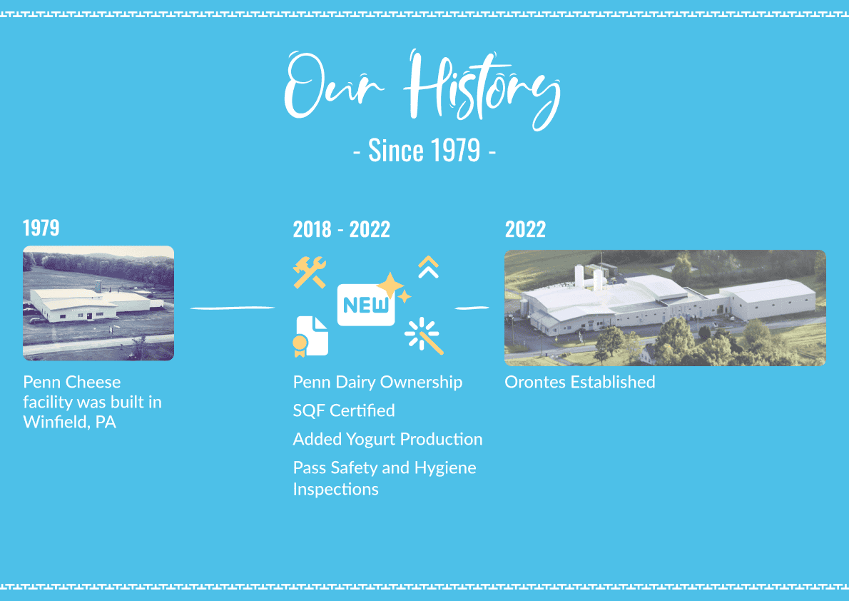
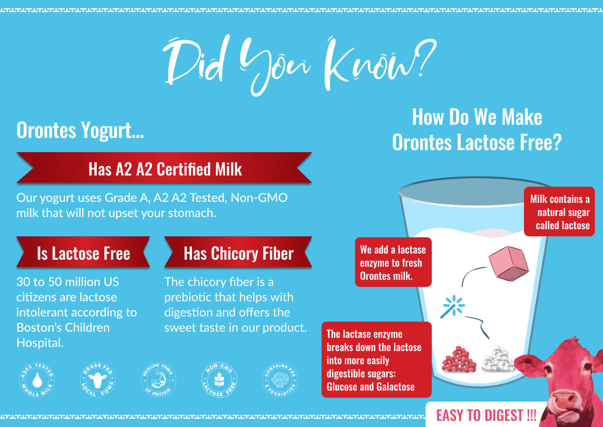
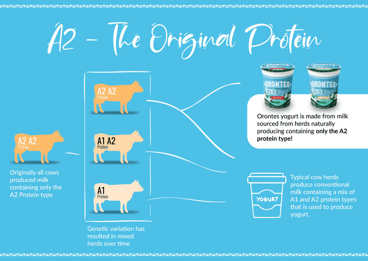
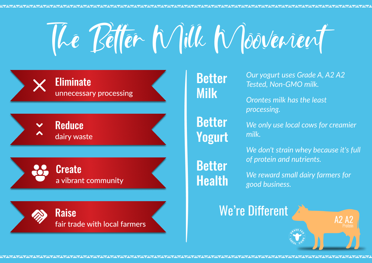
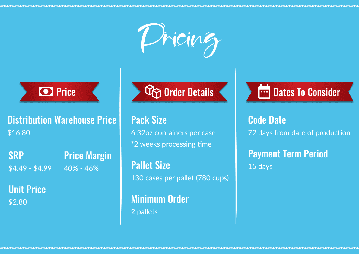
Once the visual system was established from the product label, I extended it beyond the site into a booklet covering the company's history, product lineup, pricing, and what makes Orontes different from everything else on the shelf. It used the same fonts, colors, and imagery as the website, so retail partners seeing the booklet and the site got the same consistent brand either way.
That consistency mattered. The booklet became a key piece in Orontes' retail pitch, and helped the company secure 10 retail partnerships.
FULL SITE COMPARISON ⚑
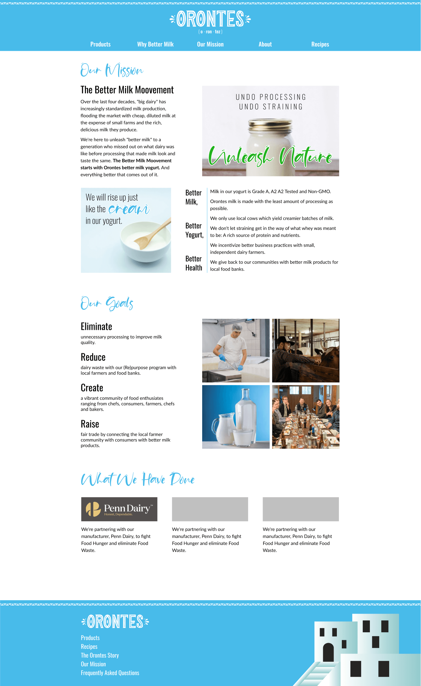
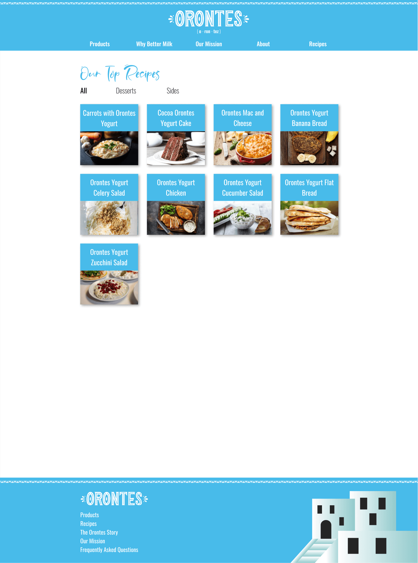
The Whole Site, Reimagined
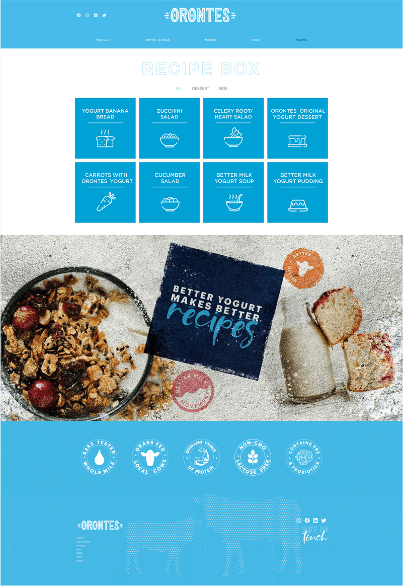
Old Pages
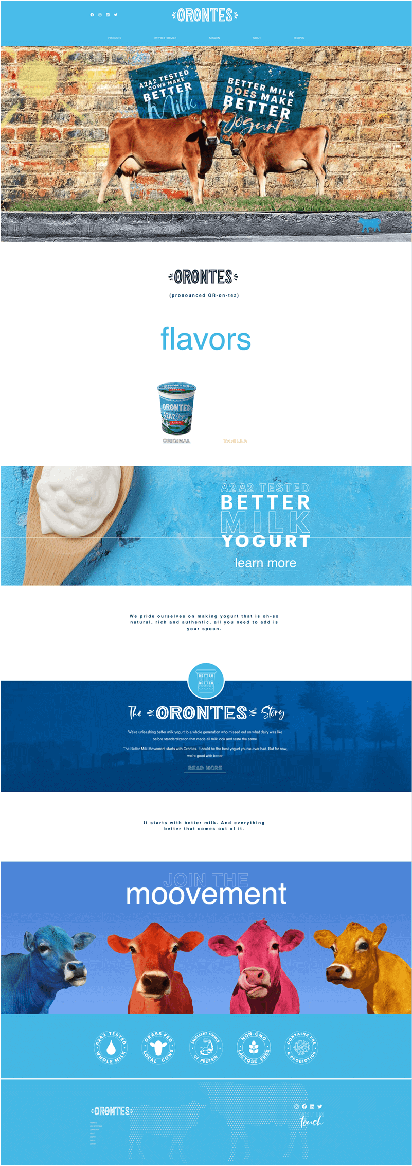
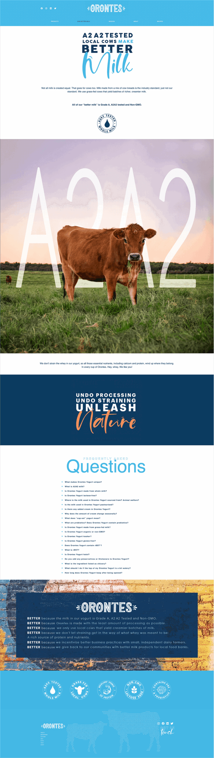
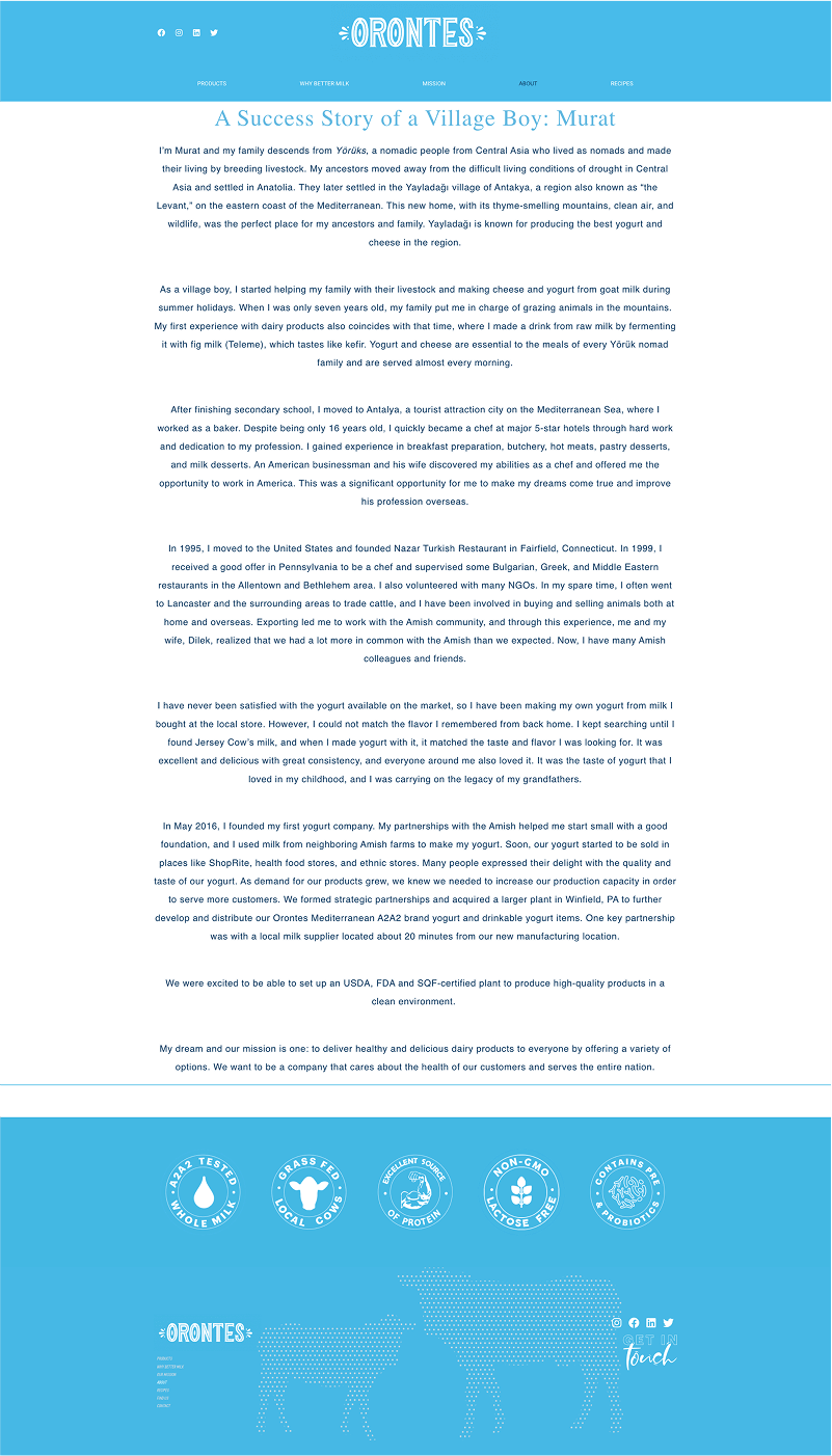
New Pages
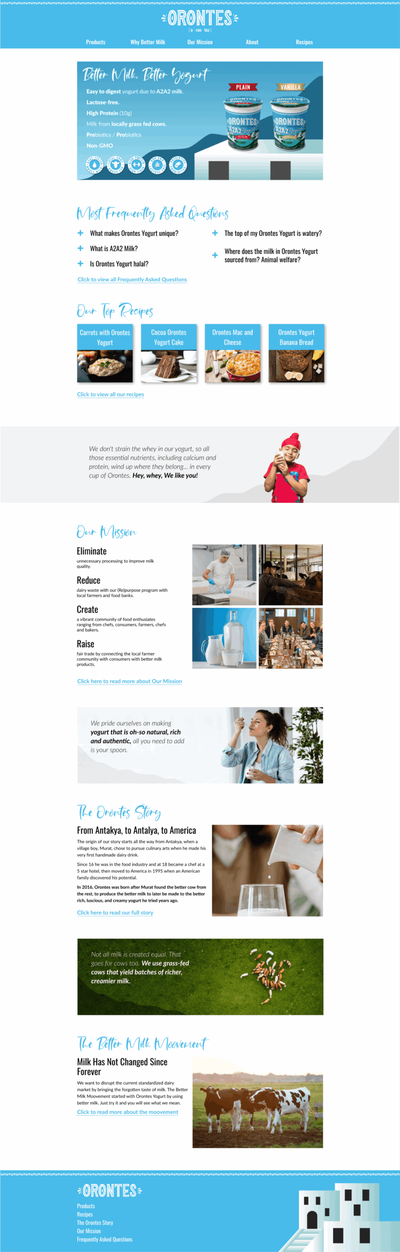
REFLECTION ⬅
Looking Back
What We Did Well
Trusted The Source Material
It had no formal brand guidelines, but it was already working commercially. Instead of introducing new direction, I built the entire site around it, which was the right call since the goal was consistency, not reinvention.
Delivered Under Pressure
Two weeks, a startup with almost no existing assets, and a marketing director's input to work in. I still shipped a complete redesign in that window, which meant making fast, confident decisions without room for multiple rounds.
What We Can Do Later
Build A CMS
Recipes and similar content shouldn't need a designer or developer every time. A lightweight CMS would let the team manage that on their own.
Document The System
The decisions right now live in my head and in Figma. A proper components and brand guidelines doc would help the next designer or developer pick this up without reverse-engineering it from screenshots.
What We Would Do Differently
Ask for more research time
I attempted a card sort early on, but two weeks didn't leave enough room for it to actually inform the design. Next time, I'd ask for the additional time upfront to run competitive research and a proper card sorting exercise, so both could genuinely shape the structure instead of happening in parallel with no real influence on the outcome.
Confirm Resources Upfront
I didn't find out until after the redesign was done that Orontes had no developer to build it. That's a day-one question, since it changes how I'd prioritize and how much time I'd spend on developer-ready specs.